“You wouldn't want novels printed in it, it would probably induce a headache.” Stephen Banham
You probably missed it when it broke onto the scene two years ago, but psychology and design researchers at RMIT University in Melbourne created a typeface called Sans Forgetica, which was designed to boost information retention for readers. It’s based on a theory called “desirable difficulty” that proposes people remember things better when their brains have to overcome minor obstacles while processing information.
Sans Forgetica is sleek and back-slanted with intermittent gaps in each letter that serve as a “simple puzzle” for the reader. The goal is to force the mind to complete the shapes and, by doing so, slow reading and enhance memory. “It should be difficult to read but not too difficult,” remarked Stephen Banham, the typeface’s designer. “In demanding this additional act, memory is more likely to be triggered.”
About 400 university students were involved in a study that found a small increase in the amount participants remembered — 57 percent of text written in Sans Forgetica, compared with 50 percent in a plain Arial. Researchers on the project stress that the font should be used sparingly for it to stay effective. If the reader’s brain gets too comfortable, it will glaze over Sans Forgetica just as easily as if it were Helvetica or Times New Roman, two of the world’s most common fonts.
If you'd like to give Sans Forgetica a try, you can download it free. It even comes with a PDF file telling the complete story behind the font.
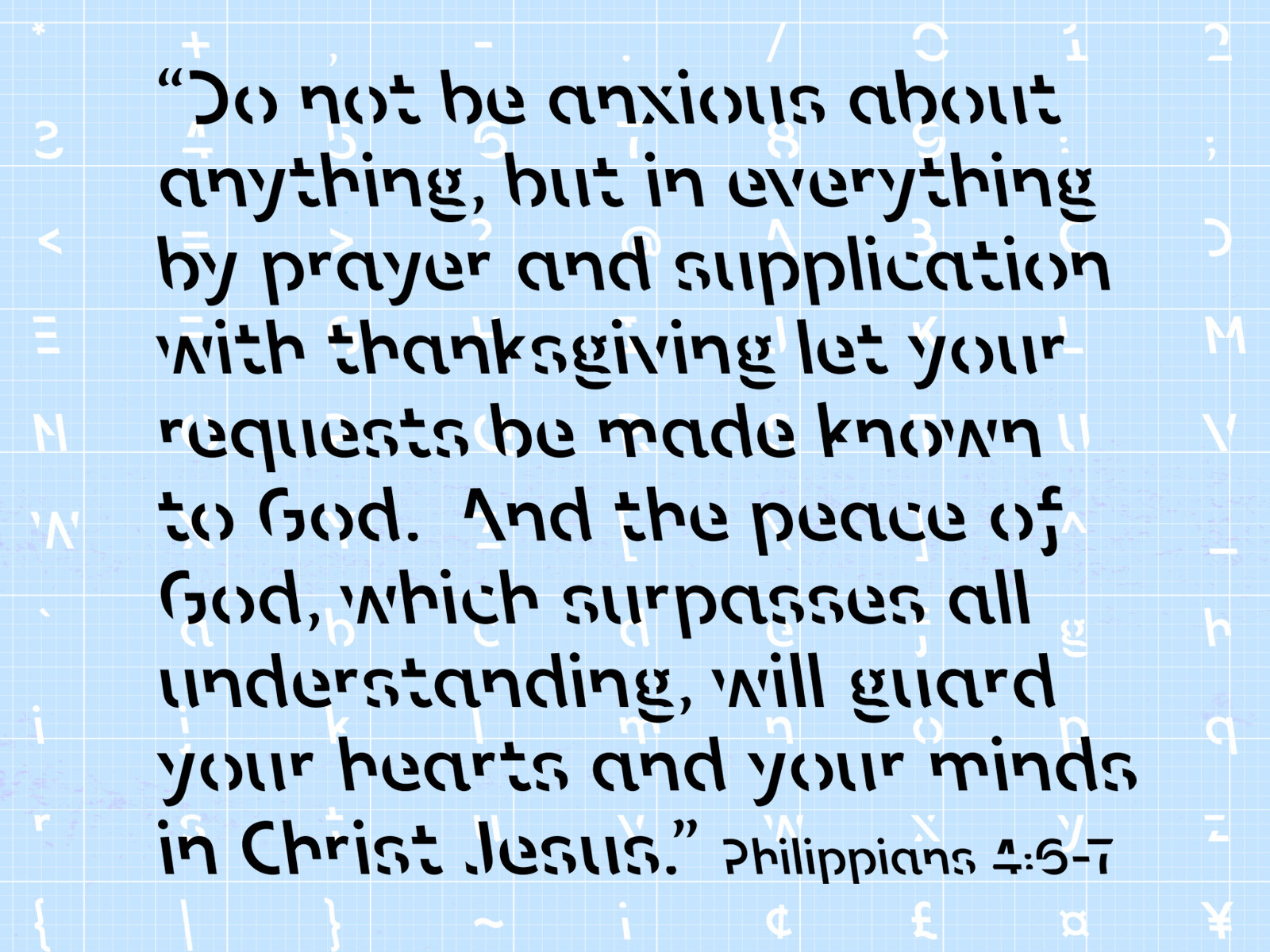
I've printed a few Bible verses in Sans Forgetica with hopes it will boost my retention.