“How lucky I am to have something that makes saying goodbye so hard.” winnie the pooh
I read a post by a fellow graphic designer lamenting the brevity of his design work. We often design a wonderful logo, brochure or poster only to have it disappear into the mists of obscurity or obsolesce. Naturally, most projects are destined for obscurity from the start. They were only intended to promote a single event or advertising campaign. Packaging is constantly changing and publications recreate themselves every five to seven years. Logos, however, are different. As designers, we like to see them stick around for awhile. After all, their repeated use and length of exposure add to their value. It can often be an organization’s greatest asset. (Think: Apple, Nike, Red Cross.)
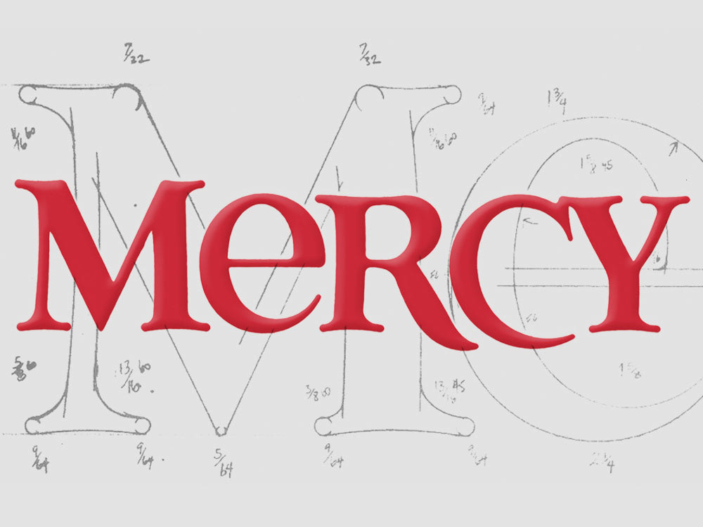
Therefore, it was with a bit of sadness that I learned that the logo I designed for Mercy Medical Center in Oklahoma City in 1987 was being replaced by a new logo. Although it was used throughout a large section of the Midwest, there were additional logos used by other hospitals and clinics within the Mercy health system across a seven-state network. They decided it was time to draw them all under one umbrella with one unifying name and symbol — thus, the change.
By the way, I really like the new logo. And I’m happy the one I designed 25 years ago served them so well for so long.