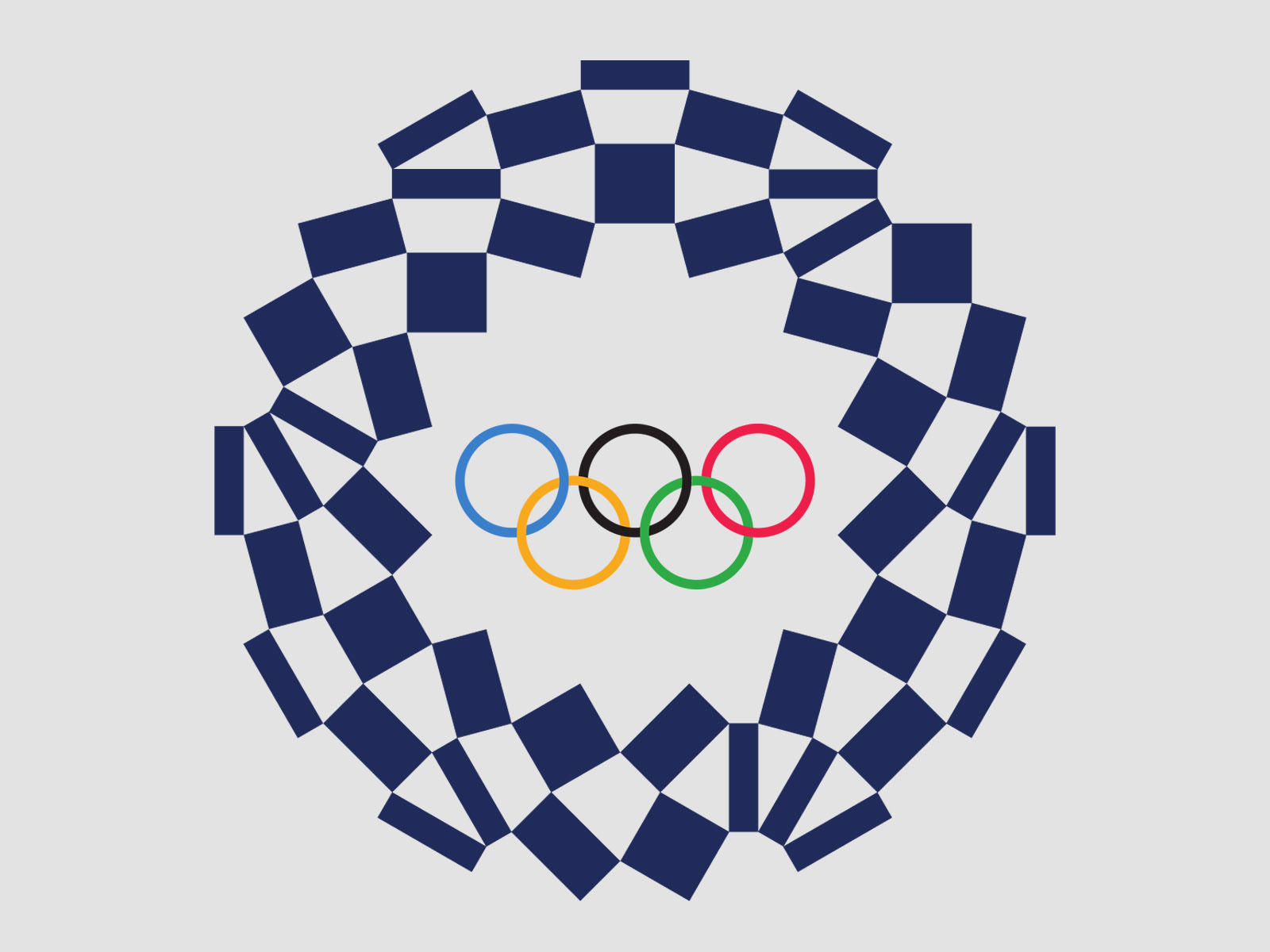
“Composed of three varieties of rectangular shapes, the design represents different countries, cultures and ways of thinking.” Tokyo Olympic Committee
Although I dearly love the Olympics, I couldn’t “get into it” this year. However, I never have trouble getting into the design of each Olympics’ logo. Even if the logo is so-so, the story behind it is always so-interesting. The Tokyo logo is no exception.
The (original) official logo was launched in July 2015. Abstract and minimal, the logo incorporated a capital T for Tokyo and the red sun of the Japanese flag. The following month, a Belgian designer filed a plagiarism lawsuit claiming the design copied key elements of a T-shaped logo he created in 2011 for Belgium’s Théâtre de Liège. He even published the two designs side-by-side online to make the similarities apparent. The image was quickly picked up by the media and shared around the world. Soon additional plagiarism allegations surfaced.
Fearing lawsuits and global backlash, the organizers quashed the logo and held an unprecedented national design competition to create its replacement, which saw almost 15,000 submissions. Four finalists were selected, and the public voted for their favorite.
The winning logo was created by Asao Tokolo, a 46-year-old artist known for his intricate, mathematical motifs. Titled the Harmonized Checkered Emblem, the indigo-blue logo features a traditional Japanese pattern called ichimatsu moyo, which was popular during the Edo period (1603–1867) and is associated with traditional Kabuki theater.
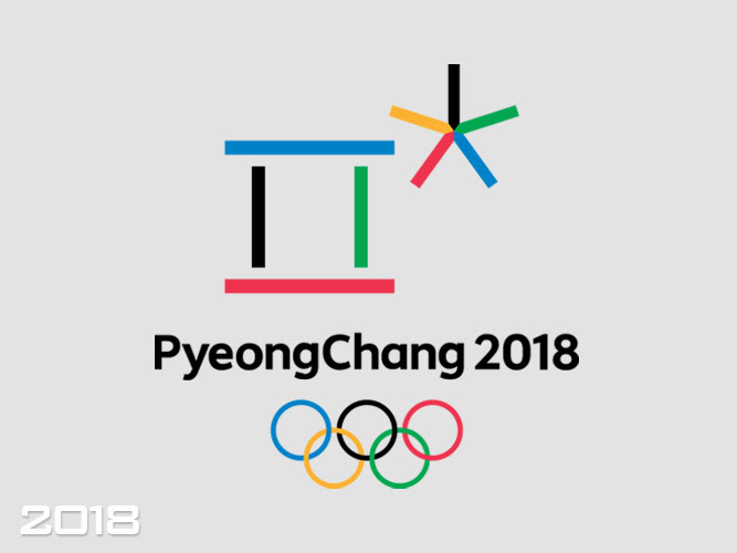
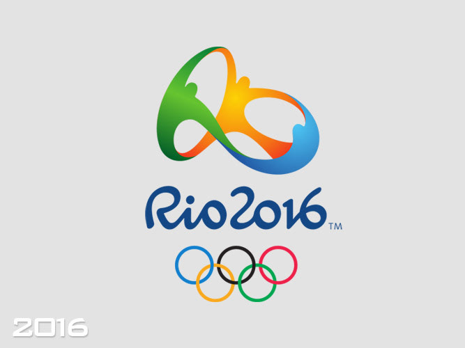
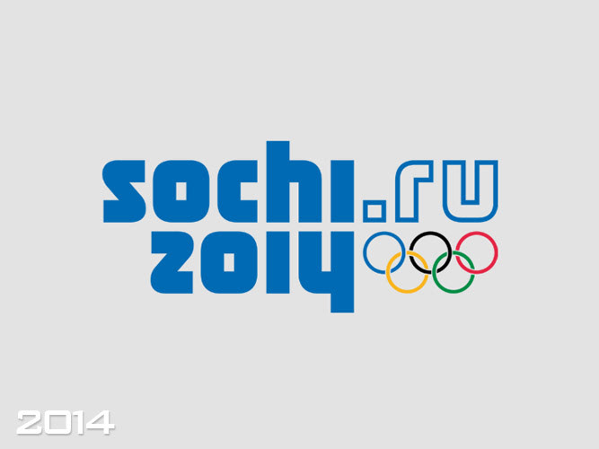
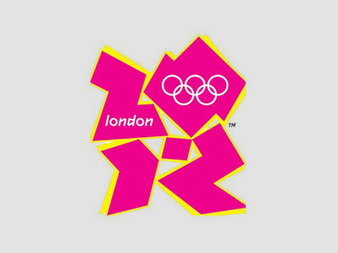
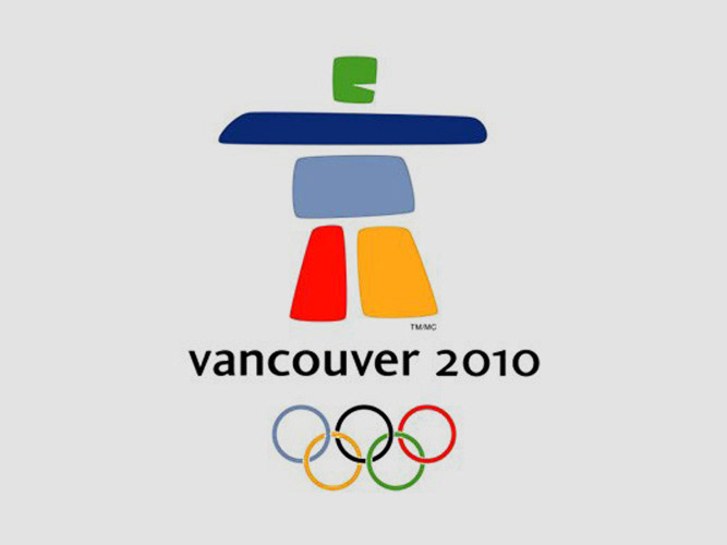
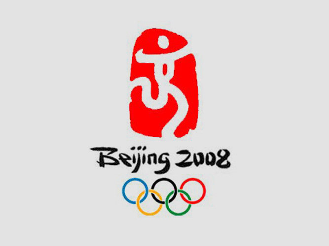
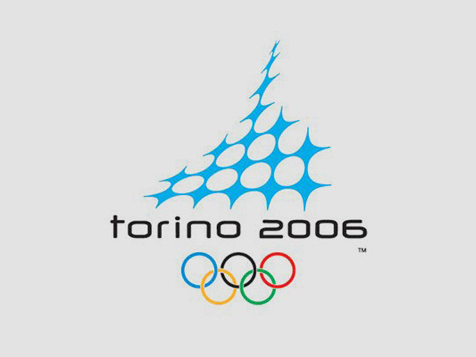
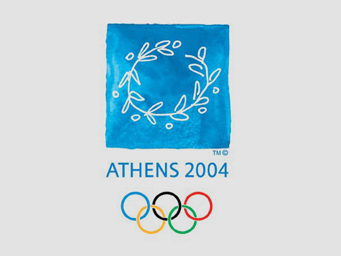
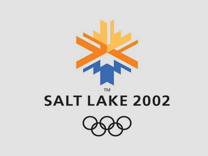
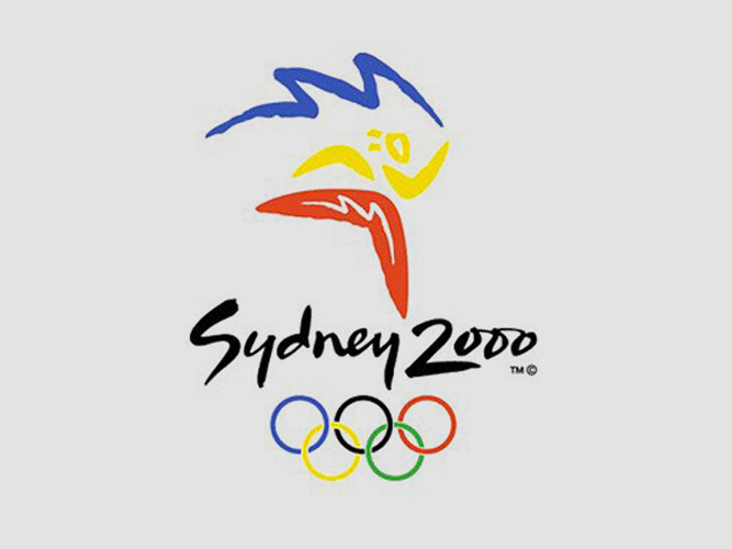
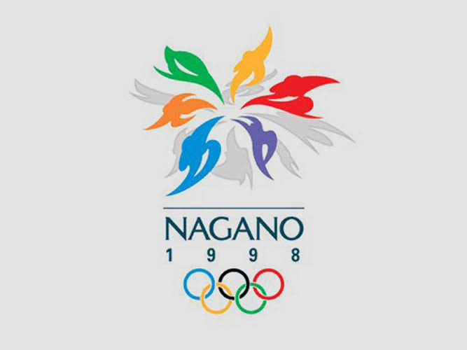
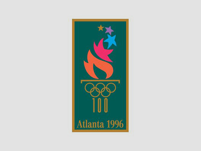
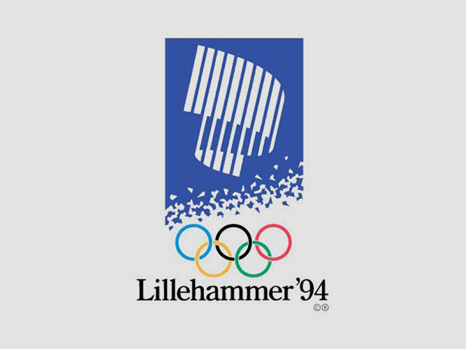
With the Paris 2024 Olympic committee accused of lifting their logo from British consulting agency 4 Global, Sochi’s monochromatic, blocky web address logo and London’s cartoonish, bright-pink logo (which continues to attract scorn), it seems the path to Olympic branding is rarely an easy one. Case in point, the London Guardian called the London logo “painfully ugly.” I agree. At a price tag of $625,000, more should have been expected (and received). So, as part of my own closing ceremony, here’s a look at previous Olympic logos — in reverse order. (I especially love Nagado’s. It’s brilliant. And I bet it didn’t cost 625,000 bucks.)