“Giant letters march across the dome of the sky: HOME NOT FOUND. Huw, who knows Comic Sans when she sees it, winces in mild disgust.” Cory Doctorow, The Rapture of the Nerds
I recently read an article discussing the proliferation of bad fonts. If you type “bad fonts” into a search engine, you’ll generate a long list of webpages and blogs discussing the world’s most disparaged fonts. Most of these blogs are good-natured, with tongue firmly planted in cheek. However, some are quite angry, bordering on vitriolic, as if their authors have been personally affronted by the ill-considered type choices of amateur designers.
Not surprisingly, Public Enemy #1 is Comic Sans, the typeface that everyone loves to hate. It has inspired websites calling for its ban and is considered in a league of its own when it comes to conspicuously bad typography.
Designed in 1995 for Microsoft, Comic Sans was a response to a design dilemma — the need to replace the inappropriate use of Times New Roman in the speech bubbles of Microsoft Bob, a beta software aimed at young users. Ultimately, it wasn’t ready in time for the release of Microsoft Bob, but was released in the Windows 95 Plus Pack. Later, it became one of the system fonts for Windows 95 and subsequent versions of both Windows and Mac OS. Its creator, Vincent Connare (he alternately designed the highly respected typeface Trebuchet), could not in his wildest dreams have foreseen the use to which Comic Sans would be put: sports team jerseys, all sorts of branding, Canadian collector coins, and even gravestones.
Last year, when CERN Laboratory in Switzerland announced the discovery of a particle consistent with Higgs boson (popularly referred to as “the God particle”), most jaw-dropping for some was the use of Comic Sans in the scientists’ PowerPoint presentation. Nuclear physics and Comic Sans seemed like strange bedfellows, indeed.
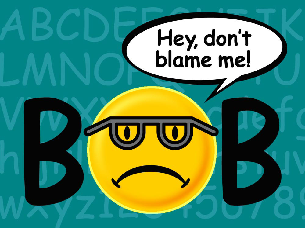
Well, I’m happy to announce that since its creation (and I’m a Windows guy), I’ve never used Comic Sans in a design project. In fact, the illustration above represents my first, carefully monitored, usage of the font. However, if you cannot make this claim, I implore you to visit the website below and renounce your typographic transgressions. (Seriously, it’s pretty funny.)