“I was in a room of the bluest light – pure blue, cerulean blue, the blue the sky would be if it were married to the sea.” Justin Cronin

Sky. Sea. Exotic birds. Tropical fish. U.S. Navy Blue Angels uniforms. All of these are identified with the color cerulean, a color between sky blue and saturated azure. Cerulean symbolizes reliability, serenity, clarity, spirituality and connection to the natural world. In the 2006 film The Devil Wears Prada, Editorial Director Miranda Priestley lectures aspiring journalist Andrea Sachs on the color by pontificating, “You go to your closet and you select … that lumpy blue sweater. … But what you don’t know is that that sweater is not just blue, it’s not turquoise, it’s not lapis, it’s actually cerulean.”
The cerulean color has roots in ancient civilization. In China, its shade of blue was highly valued and affiliated with luxury and prestige. In Europe, the birth of the color began with the discovery of the pigment cobalt blue in 1802 by French chemist Louis Jacques Thénard. Three years later, Swiss chemist Albrecht Höpfner, inspired by the blue hues used in Chinese porcelain, created cerulean from cobalt stannate. However, it would take several decades for the pigment to become commercially available – just in time to be embraced by Impressionist painters.Almost a century later, the United Nations was formed at the end of World War II to maintain international peace and promote cooperation among its member nations and states. And while the success of its activities can be debated, there’s little debate over the success of its branding. Officially named United Nations Blue, the UN adopted cerulean for their emblem. It was selected as a contrast to the red and black hues commonly associated with bloodshed and conflict. It is a soft, serene shade of blue that evokes a sense of tranquility and openness, often seen in the sky on a clear day and the calm waters of a peaceful lake.

When the United Nations was formed in 1945, they adopted cerulean for their emblem. The designer Oliver Lundquist stated that he chose the color because it was "the opposite of red, the color of war."

Making an impression.
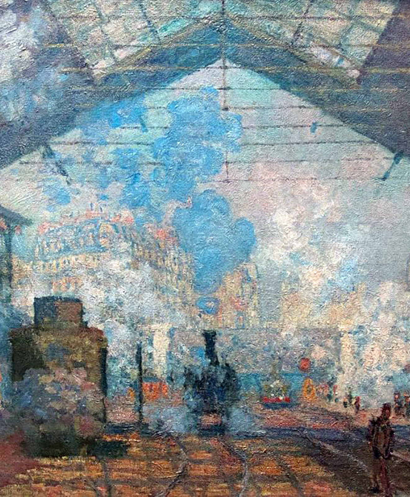
The Impressionists embraced cerulean for its ability to capture the subtleties of light and atmosphere. One notable example is Claude Monet's La Gare Saint-Lazare (1877), where his sky is complimented by bright cerulean puffs of smoke acting almost as clouds across the foggy scene in the train station. Fellow Impressionists Édouard Manet, Alfred Sisley, Camille Pissarro, Paul Cézanne and Berthe Morisot incorporated cerulean into their paintings to achieve a range of effects and hues, infusing their masterpieces with a sense of vibrance and life. A Parisian contemporary of the Impressionists, yet working in a different style, Jehan Georges Vibert referred to this intense pigment as his "dazzler.”