“Go out on a limb. That’s where the fruit is.” jimmy carter (by way of mark twain)
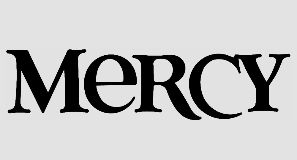
In a previous Musing, Sad to See Her Go, I mentioned that the logo I designed for Mercy Hospital in 1987 was being replaced by a new logo. As a large healthcare system, it will take over a year to phase out the old logo and adopt the new. However, since it’s on its way out, I now feel safe to let the cat out of the bag (or should I say “rabbit”).
A few months after the logo began appearing in print, I discovered a quirky, unintentional component of the design — the negative space between the C and the Y created a bunny rabbit. I’m not sure anyone else ever noticed this.
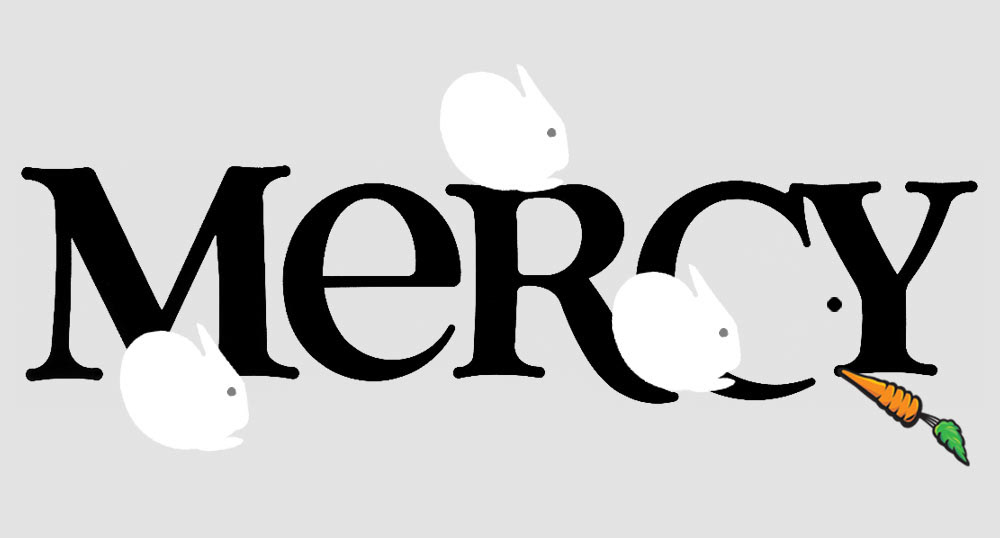
If I’d had any guts at the time, I would have suggested we alter the logo slightly to create a special mark for Mercy’s Birthing Center.