“The details are not the details. They make the design.” Charles Eames
There are two key elements to a logo design: the idea and the execution. Regardless of how original, clever or brilliant the idea is, it will fall short unless it is well executed. The brighter the idea, the more you can get away with in execution; conversely, the weaker the idea, the better the execution has to be.
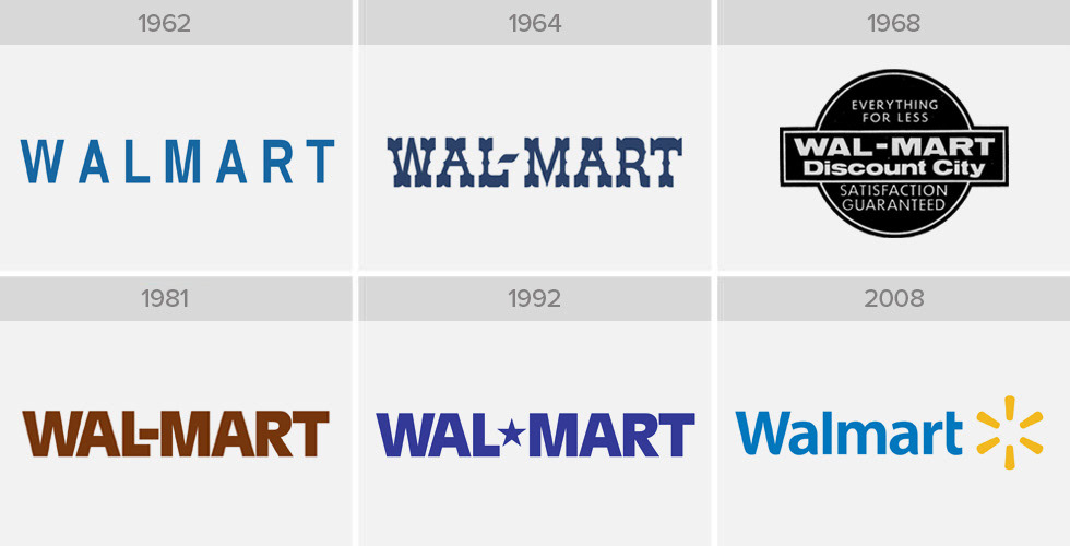
The evolution of the Walmart logo is a case in point. The original logo was a weak idea, coupled with not so great an execution. After changing every few years, the company could finally afford top designers. Now, the logo has been perfected in execution while still retaining its original, weak idea. Subsequently, it has become universally recognized
The same can be seen in other logo upgrades, such as Google, IBM and McDonald’s. Where the logo has broad recognition, the idea is usually not changed. Instead, the execution is perfected. Here are a few characteristics of a well-designed logo.
Color Harmony
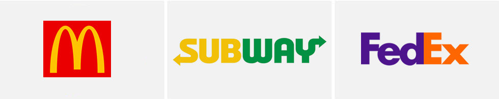
The basics of color harmony should be applied to logo design. While a logo should work in black and white, colors are important to branding. Some logo colors are so recognizable they can almost stand on their own but there are also logos that employ two colors, and in that case, it’s important to use colors that work well together. McDonald’s red and yellow are analogous colors on the color wheel as are the Subway green and yellow colors. The FedEx orange and purple are harmonious colors.
Accuracy of Shapes
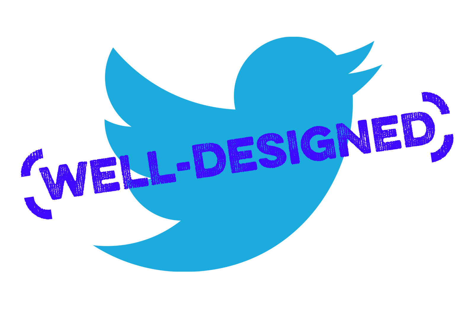
If your logo has a circle, then it had better be a perfect circle. If your logo has a square, then make sure it is in fact a square. Arcs should be a segment of a circle. Compare the old and new Twitter bird and you can see how much of a difference it makes to have accuracy in shapes. The revised design definitely looks less cartoonish. Which is okay, unless you don't want your organization to be seen that way.

Typography
As mentioned in a previous Logo-ology, “logo” is derived from “logotype” — the way in which the name of a product or company is written. While logo has since come to represent the name or symbol of a product or company, it originally was entirely a reference to the text itself. And this points out the importance of typography in creating a logo. Therefore, it is important to avoid these common mistakes: inconsistent capitalization, too many fonts, bad kerning, bad letter spacing or inappropriate fonts.
Side Trip
A logo’s color can increase a brand’s recognition up to 80 percent. Here’s a cheat sheet to help you choose the right color.