“There is no exquisite beauty … without some strangeness in the proportion.” Edgar Allan Poe
I'm not a coffee drinker. I've tried, but I’ve never been able to acquire a taste for that adult beverage. Therefore, the only time I darken the door of a Starbucks is to buy coffee mugs or gift cards for my son-in-law. (Well, there was that time in Madrid when my wife and I used their restrooms and Wi-Fi.) So, the only time I really notice their logo is when I pass a store while driving around town.
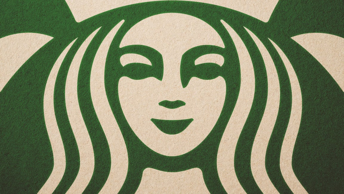
The Starbucks siren logo has been in existence since 1971, but in 2011 the global branding team at Lippincott was hired to give her a “facelift.” Her original woodcut appearance seemed a little rustic for a modern corporate brand. The obvious approach was to clean up the lines and make her face and hair more symmetrical — the left side a perfect mirror of the right.
As the siren became more symmetrical — they even toyed with giving her friendly eyes — something seemed wrong. She was perfect. Even beautiful. But also a bit creepy.
After stepping back and viewing all the iterations together, the design team recognized the core problem: the geometry of her beauty-defining symmetry. They had robbed her of her humanity. They had turned her into Barbie.
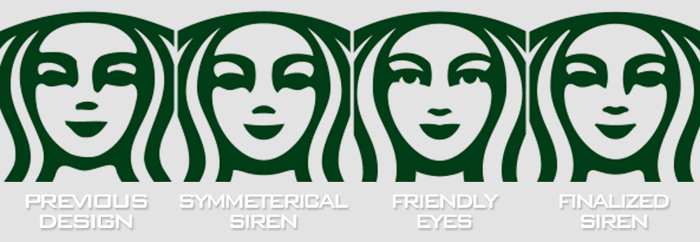
In the end, with slight refinements, they returned the elongated shadow to the right side of the nose, injecting a more natural countenance. She was no longer perfect. It was a eureka moment when the team realized they were trying to make her too beautiful.