“A logo is not a brand. It's only a symbol for a brand.” MArty Neumeier

It’s rare when you see a logo in isolation, on its own without the context of a website or business card or brochure or app icon. That’s why it’s imperative a logo take into consideration the wide variety of relevant touchpoints encountered by potential customers. It’s akin to taking a step back to look at the bigger picture, to see where you are and what you’re surrounded by. In design terms, the bigger picture is every item on which the logo might appear.
Look and Feel
Look and feel is the visual language that makes a logo and its occupying branding system proprietary and immediately recognizable. It also expresses a point of view. A logo should convey the fundamental essence of an organization, product or service. It’s the visual manifestation of its nature, its essence, its culture and its reason for being.
The logo and its support system of color, imagery, typography and composition is what makes an entire branding program cohesive and differentiated. In the best brands, designers create an overall look that resonates in the mind of the customer and rises above the clutter of an overcrowded visual environment. All elements of a visual language — especially the logo — should be intentionally designed to advance the brand strategy, each doing its part and working together as a whole to unify and distinguish.
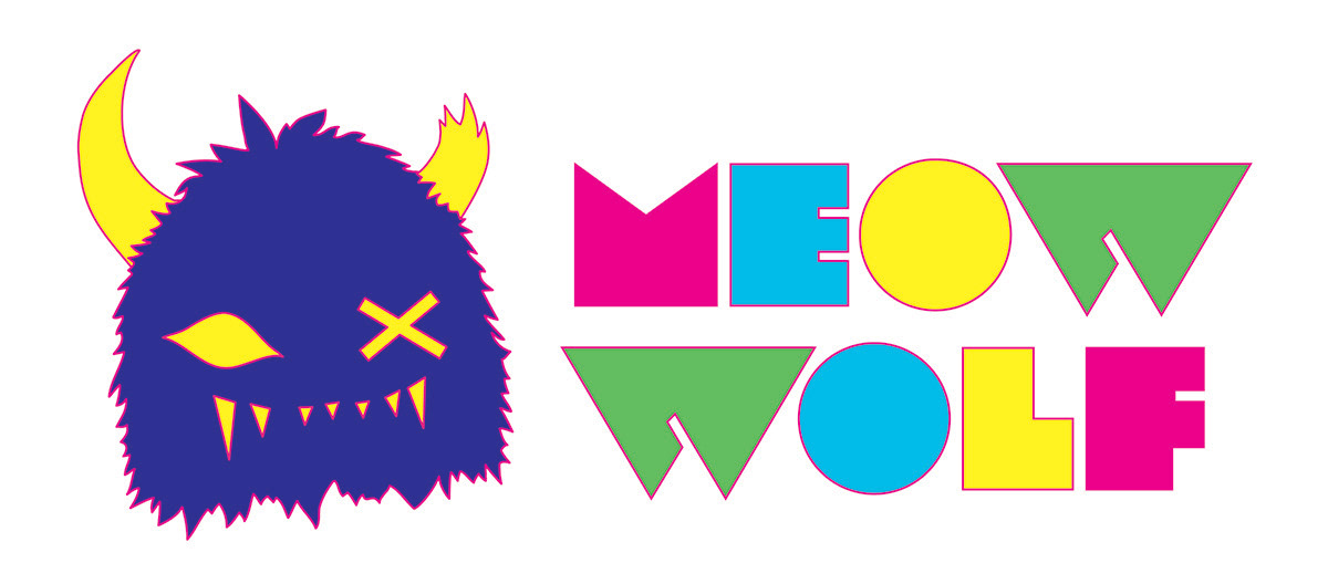
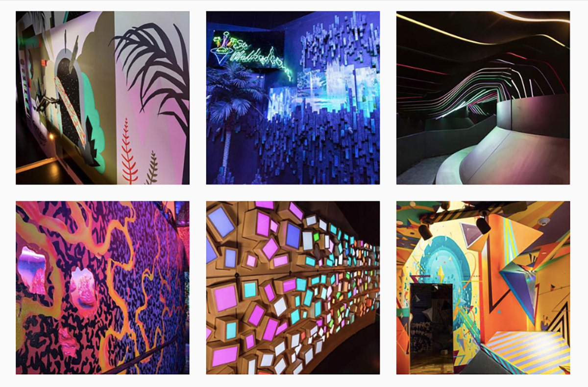
Meow Wolf, an arts and entertainment group that creates immersive and interactive experiences, has created a brand that emphasizes its goal of transporting audiences into fantastic realms of story and exploration.
Inform or Informed
If it is a new company, the logo design can help inform the direction of the overall branding. Whether it be color scheme, typography, style, etc., the logo serves as a point of departure. In the case of an existing company with an established brand, a logo re-design should be informed by the brand and launch it into fresh, uncharted waters.
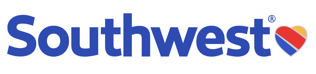
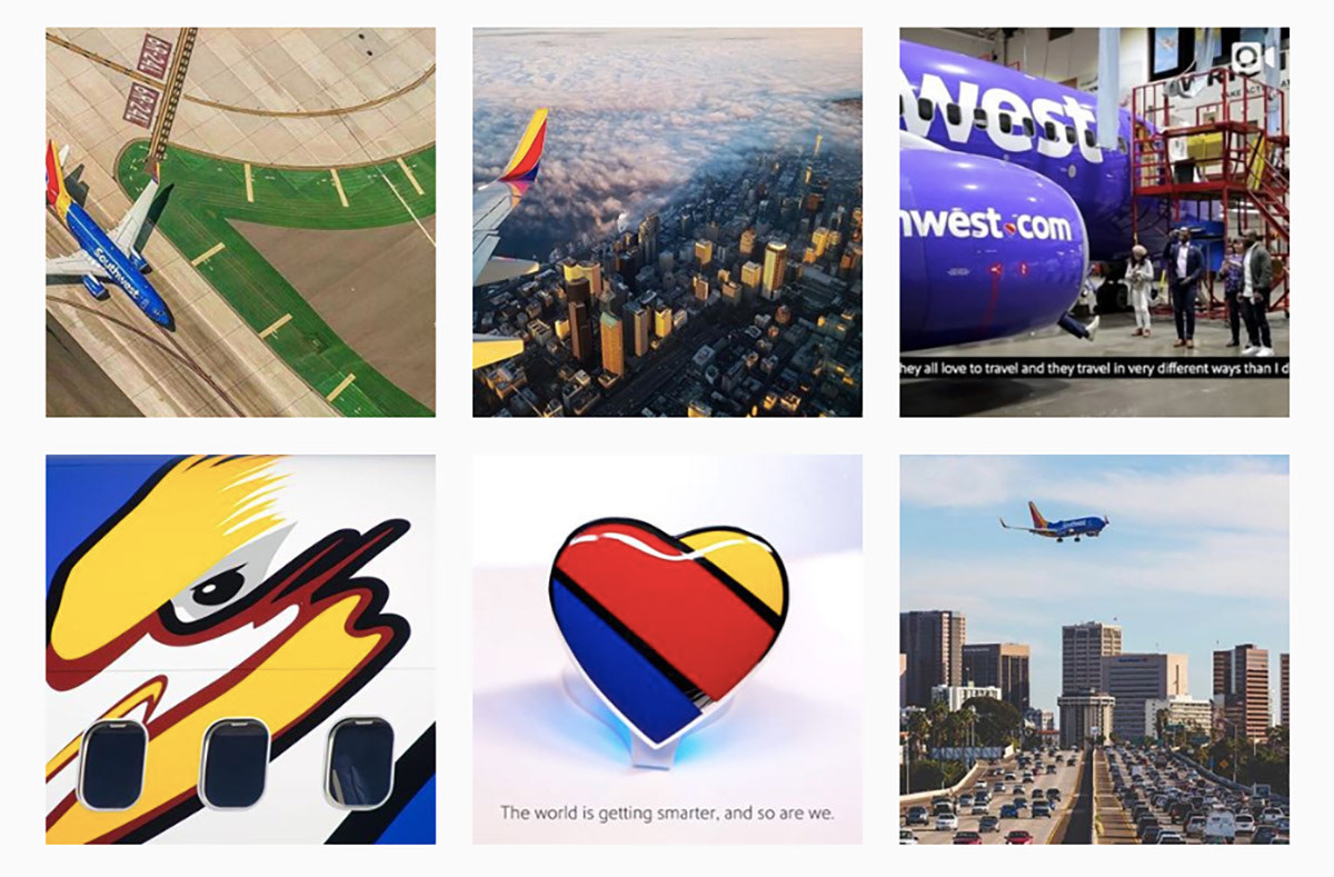
When Southwest Airlines unveiled a rebrand in 2016, it had already established (branded) itself as a friendly, fun-loving air carrier. With its new yellow, red and blue tri-color scheme, it reinforced that sense of warmth, adding more personality and making the airline feel even more welcoming. That added warmth and personality carried over into every aspect of their brand, from website to ads to airplanes.

Side Trip
If you want to dive deep into 11 outstanding brand identities from 2019, look no farther than this extensive overview by Richard Baird.