“I remember using my typeface and thinking, I’m gonna make this look really ugly.” Harriot Goren, Creator of the typeface Morire
Remember the 90s, when things were messy, especially type design? Words were splayed and chaotic, letters blurred or jagged. Textures were thick and heavy. Concert posters and album covers looked like someone had splattered paint on them and then scratched out band names. At its peak, this typography style — called grunge — was everywhere, used by everyone. Not just musicians, but movies, magazines, clothing manufacturers and major advertisers appropriated its unfinished and frenzied aesthetic, and it became the largest, most cohesive movement in recent typographic history. It was truly everywhere — then it wasn’t.
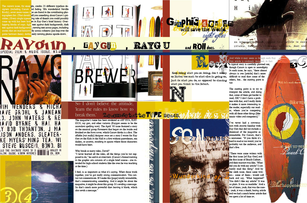
David Carson, designer of Ray Gun magazine and so-called Godfather of Grunge, employed this two-fold approach to type design: you don’t have to know the rules before breaking them and never mistake legibility for communication. And a multitude of designers bought into it. Many, like myself, stuck a toe into the murky stream, found the water too brackish and backed off.
In many ways, “grunge” denotes for typography what it does for music: unfettered, unrestrained, a rebellion against convention. That was the appeal for designers. From the viewer’s perspective, the appeal of grunge was based on an even more basic idea: it had not been seen before. It wasn’t just the experimental design of the letters, but the way they were placed on the page. Its bedlam and body language seemed dangerous and in-your-face. Who cared if it was hard to read and produced mental anguish and eyestrain to digest? It was different! It was cool!
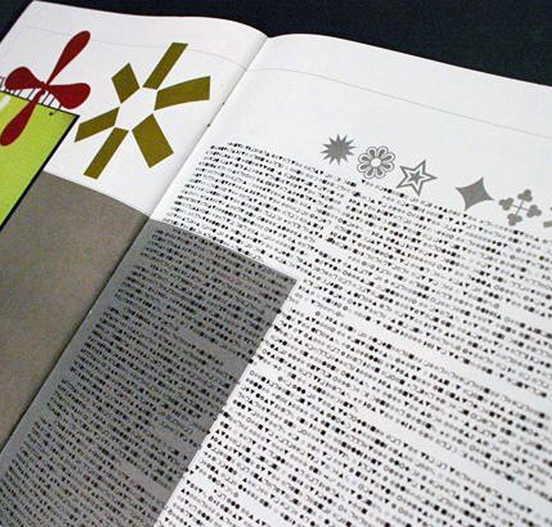
And that was the root of its demise. It sacrificed legibility for novelty. Content no longer mattered. It simply served to create eye candy. Letters and words became strokes on an abstract painting. One clear example is when Carson disliked a Ray Gun article on Bryan Ferry so much he set the entire spread in Zapf Dingbats.
Of course, grunge typography can still be effective when used sparingly to emphasize distress, destruction, carelessness or mayhem. Otherwise … R.I.P.