“We must always change, renew, rejuvenate ourselves; otherwise, we harden.” Johann Wolfgang von Goethe
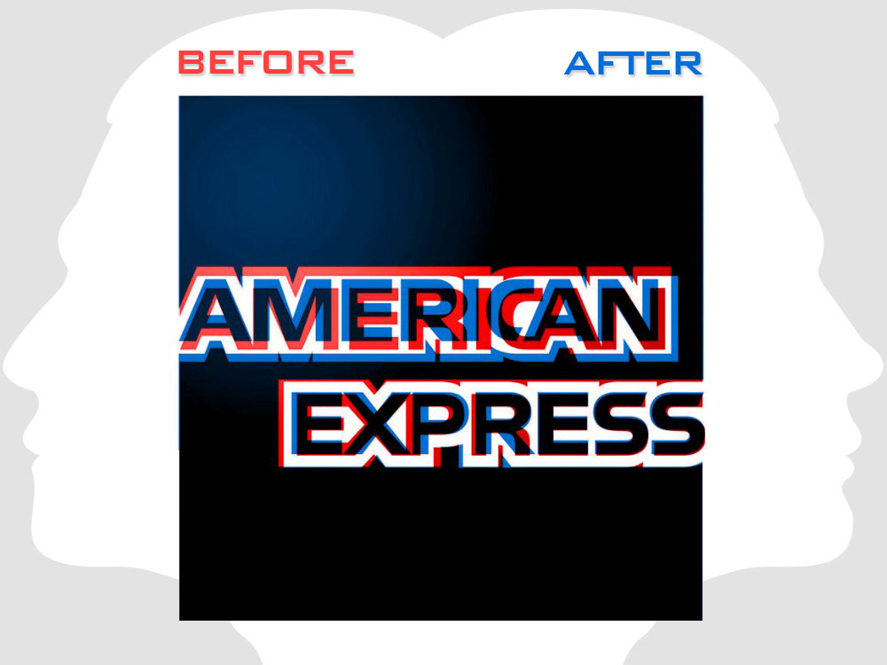
Is it time for your logo to have a facelift? A recent example is the subtle freshening up of American Express's 40+ year-old logo.
In case it slipped under your radar, American Express has a new logo (sort of). It’s part of a complete brand redesign led by Pentagram partner Abbott Miller. When discussing the facelift, Miller said, “We didn’t want people to say, ‘Oh, did you see that new logo [ugh].’ It was more if you cleaned the smudges off your lenses. It’s cleaner. Clearer.”
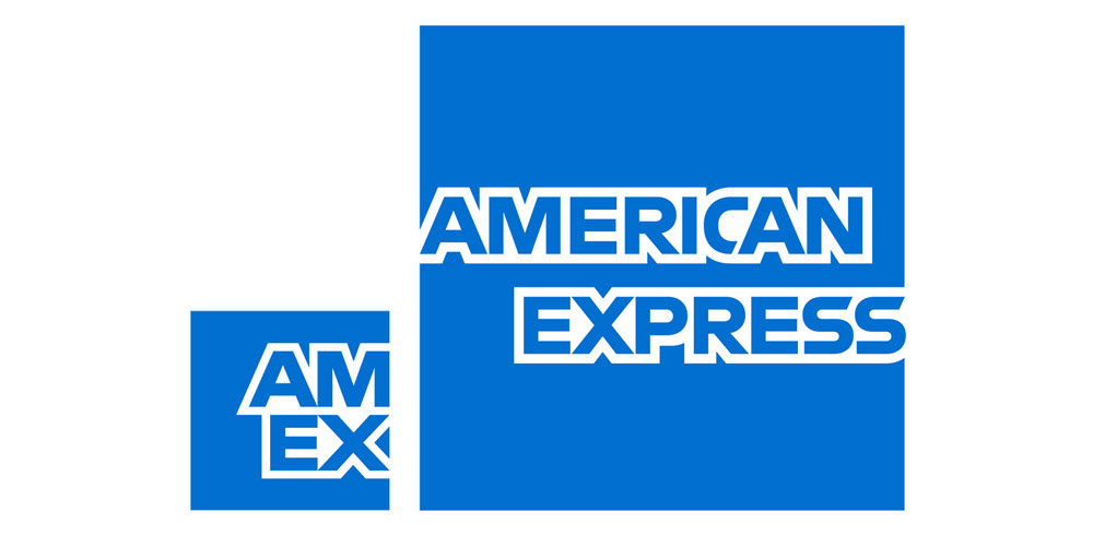
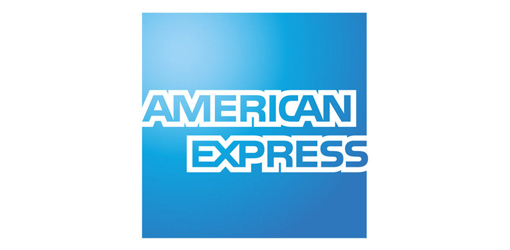
For one thing, the credit card company has swapped out its blue box with a gradient for a blue box without a gradient.However, it’s more than that. While Pentagram’s work doesn’t look significant at first glance, when you analyze the logo itself, you discover the wordmark has been redesigned to break American Express out of its blue box. The lettering was redrawn to make it more legible when removed from its blue box to stand alone, such as on stationery and signage.
A secondary logo was also created for use with smartphones and apps. This second version simply reads “AM EX” over two lines. The truncated design and reduced size are crucial at pixel level and allows the logo to be legible when presented on small screens.
If you’re interested in a comprehensive examination of American Express’s updated branding, click on the link below.
In the meantime, perhaps it’s time you considered freshening up your logo. Or perhaps a total rebranding of your organization. If so, please contact me.