“The strongest logos tell simple stories.” Sol Sender
A logo can communicate its message by name alone or by pairing a name with a symbol to represent a core value, product or service. Or it can communicate a message through the execution of the design — simplicity, luxury, high-tech, counter-cultural, vintage are all easily communicated through the execution of a design. Or the logo can communicate the product or service being sold. Or the logo can communicate a story that is either understood implicitly or after some explanation.
Communicates the Name
This provides the most basic duty of a logo — to tell us what the brand is. Coca-Cola, IBM, Ford — all these logos are simply an execution of the brand name. Logos that stand alone, independent of any wordmark, such as Apple, Twitter and Nike, all started with a pictorial or abstract mark incorporated with their name. Only through a lot of repeated use and almost universal symbol recognition were they able to drop their name from their logo.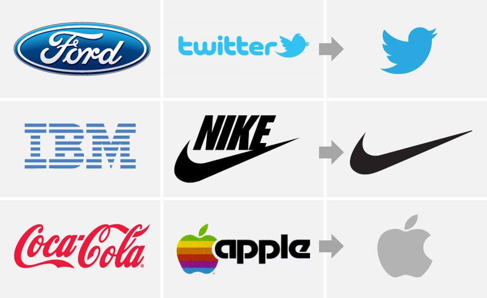
Communicates the Audience
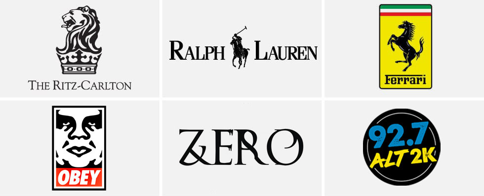
Ritz-Carlton has a complex logo of a lion’s head on top of a crown. The reality is that the logo’s complexity is actually part of the message. It says that the brand is exclusive and luxurious. This same design messaging can be seen in the logo for Ralph Lauren and Ferrari. High-end beverages also use this strategy. On the other hand, logos for Obey Clothing, Zero Skateboards and 92.7 ALT 2K are designed to reach a totally different audience.
Communicates the Product
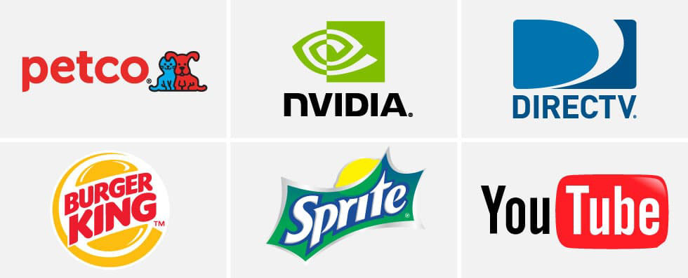
Good examples are PetCo, Nvidia, DirecTV, Burger King and Sprite. In each case, the logo shows you something about the product they sell. PetCo is quite literal in showing a cat and a dog. Nvidia shows an eye, which has a direct relation to graphics cards. Burger King’s logo is sandwiched inside a hamburger, and Sprite features a lemon and a lime.
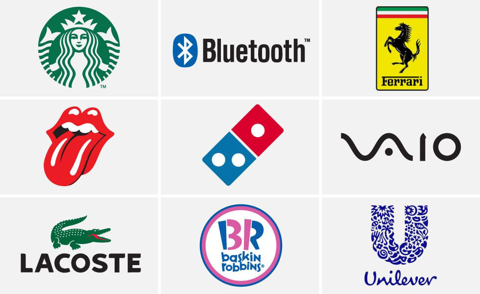
Communicates the Story
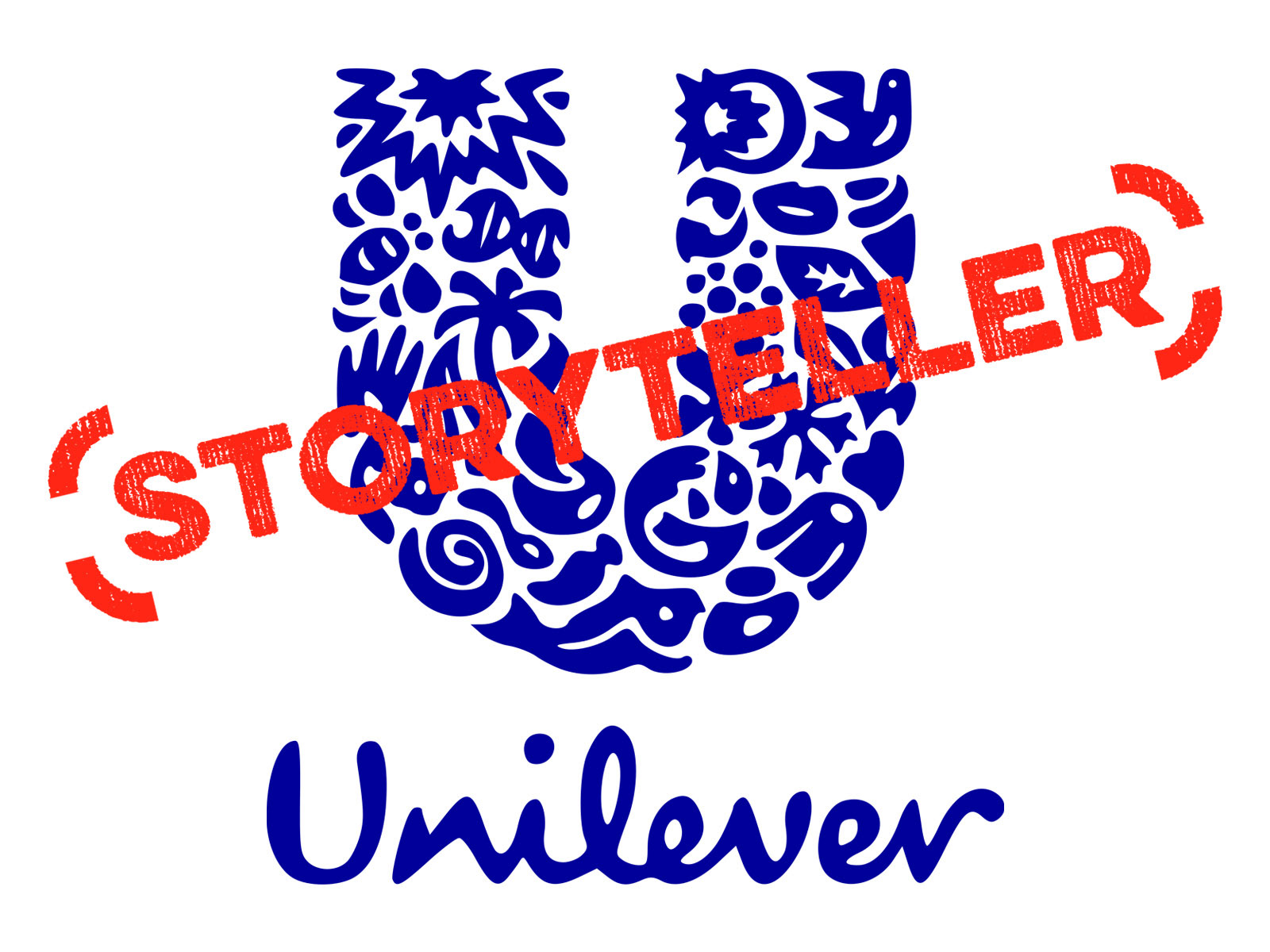
The argument can easily be made that this is the best kind of logo. These are the logos that leave a lasting impression. The Starbucks logo has a backstory that involves a Norse woodcut siren. The story of the Bluetooth logo involves a Danish King. Ferrari’s famous logo has its origin in a famed Italian World War I fighter pilot. Even the Domino’s logo has some significance to the three dots — this was the original number of franchises at the time the logo was designed. And did you know the Unilever logo includes 25 different illustrations — one for each of the industries and fields in which its products land? The great thing about these logos is that people who learn the story and who are interested in them will likely share that story, creating instant brand ambassadors.
Side Trip
In 1970, Unilever changed its logo to one that consists of 25 icons intricately woven together to form a U, each representing a division of the company. Click here to read the explanation for each.