“To be trusted is a greater compliment than being loved.” George MacDonald
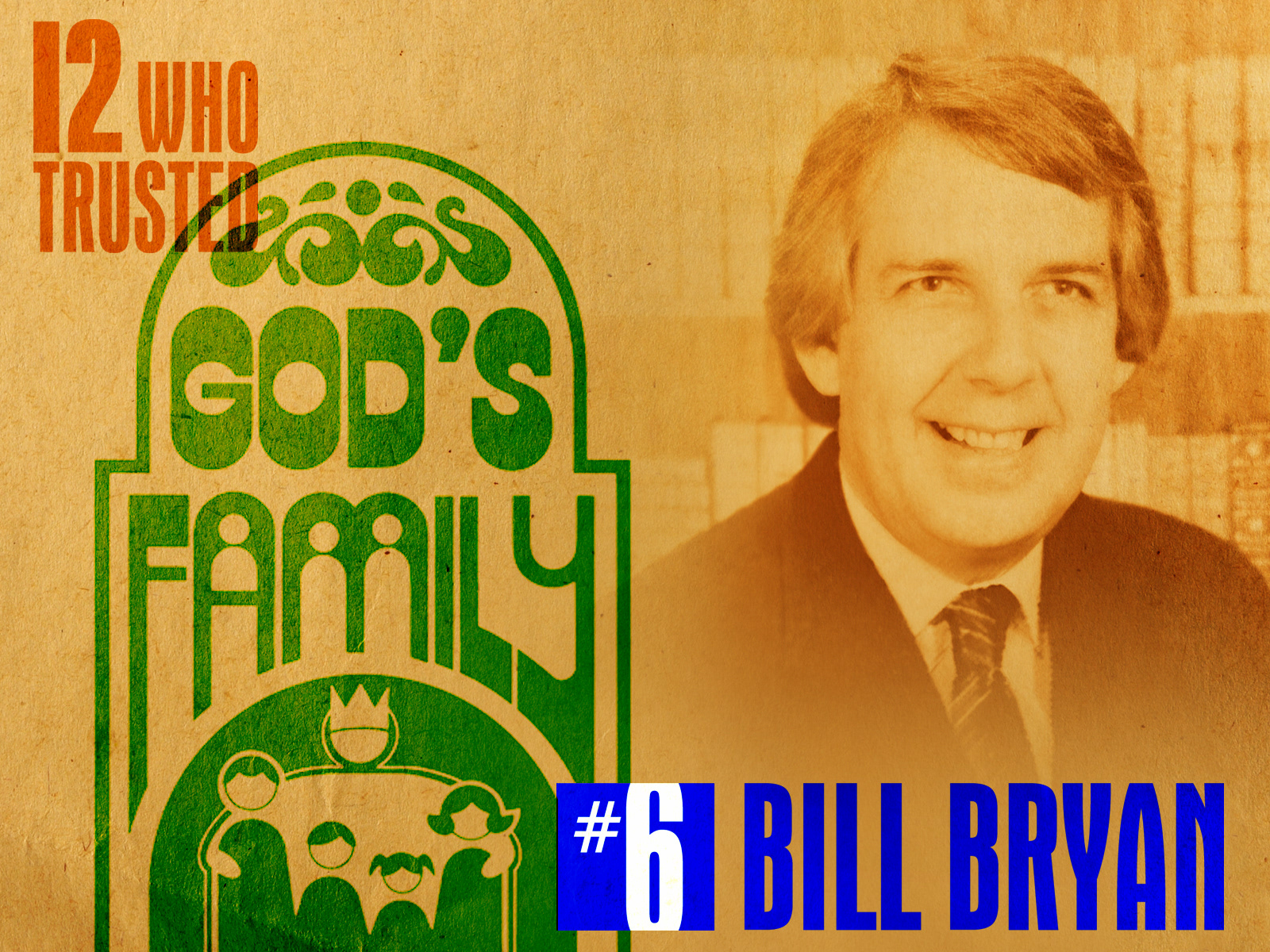
I met Bill Bryan in September 1982. He immediately put me to work for First Southern Baptist Church, Del City, Oklahoma, with a continuous stream of projects over the next four years. He often had me working on multiple projects at a time. Bill had the title of Minister of Church Growth and Development and was a recognized expert at using outreach campaigns to increase Sunday School attendance. Bill and I developed such a rapport that, after a few months of working together, I no longer provided preliminary sketches but went ahead and executed the final artwork. He would invariably say, “That’s exactly what I wanted.”
I’ve rarely had the freedom to let my creative juices flow the way I did as when I was working with Bill. He was open to all ideas and welcomed unique approaches, like die-cut brochures and packaging and incorporating specialty items such as puffy stickers and lapel pins. During the God’s Family Place campaign, two gigantic full-color signs in the shape of the logo were installed on the church building.
The last project I completed for Bill was in 1986 shortly before he left First Southern to join the staff of Roswell Street Baptist Church in Marietta, Georgia. It was the logo for a year-long growth emphasis called Discovery ’86, timed to begin with First Southern’s move to its new campus on South Sooner Road in Oklahoma City.

God’s Family Place was my first project for Bill. It was a growth campaign emphasizing that First Southern was a church with a place for every member of the family.

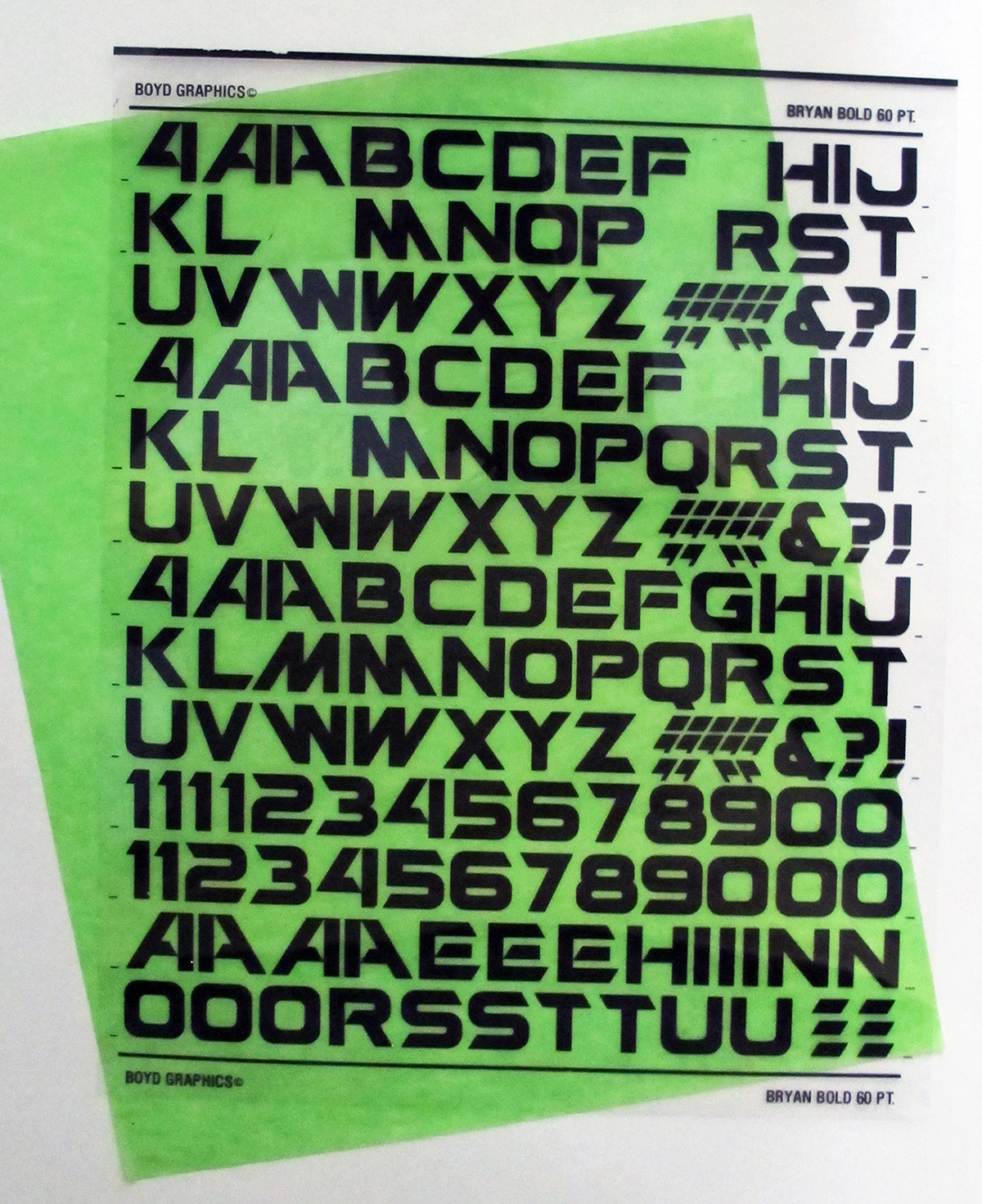
God’s Family Care Units was spinoff of God’s Family Place, with an emphasis promoting the importance of Sunday School classes for spiritual and emotional health. Unfortunately, I don’t have a copy of the logo, but here’s the typeface I designed for it. The lettering, titled Bryan Bold, was used with the logo. I had dry transfer lettering made so that headlines could be easily created for promotional materials.
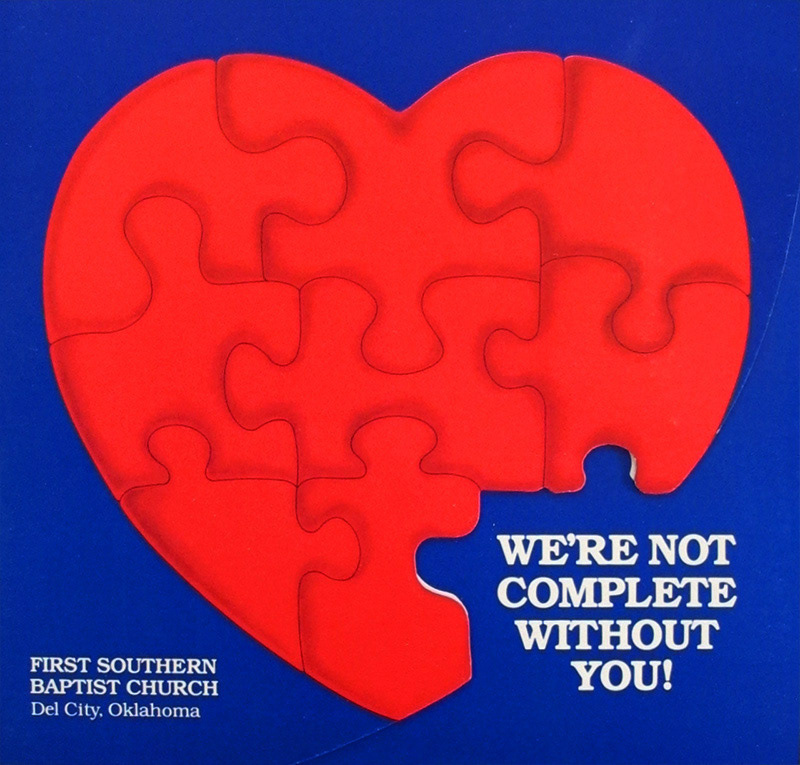
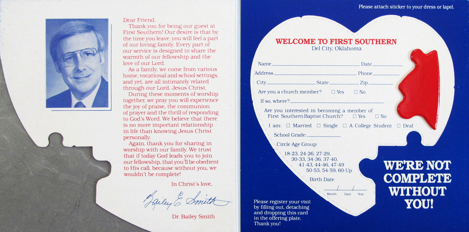

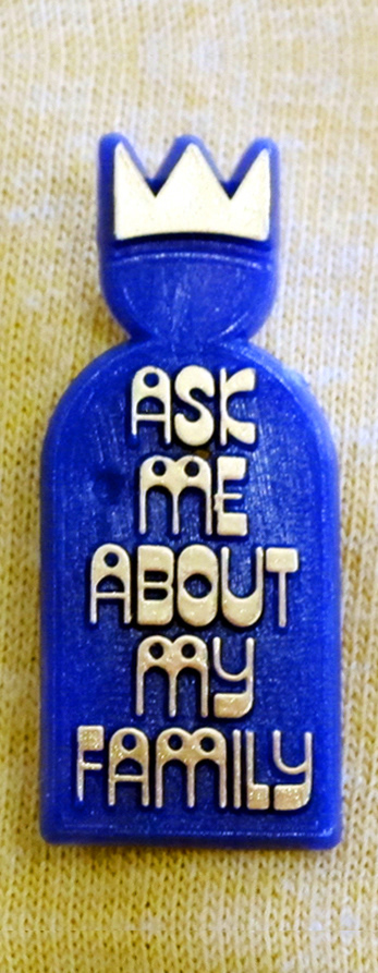
We’re Not Complete Without You was another church growth campaign implementing a die-cut visitor’s card with a puffy lapel sticker to help members identify and greet guests.
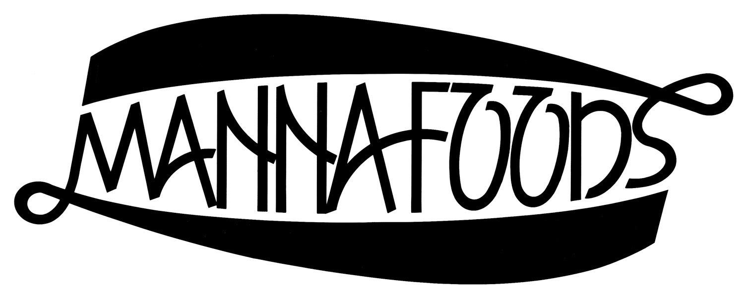
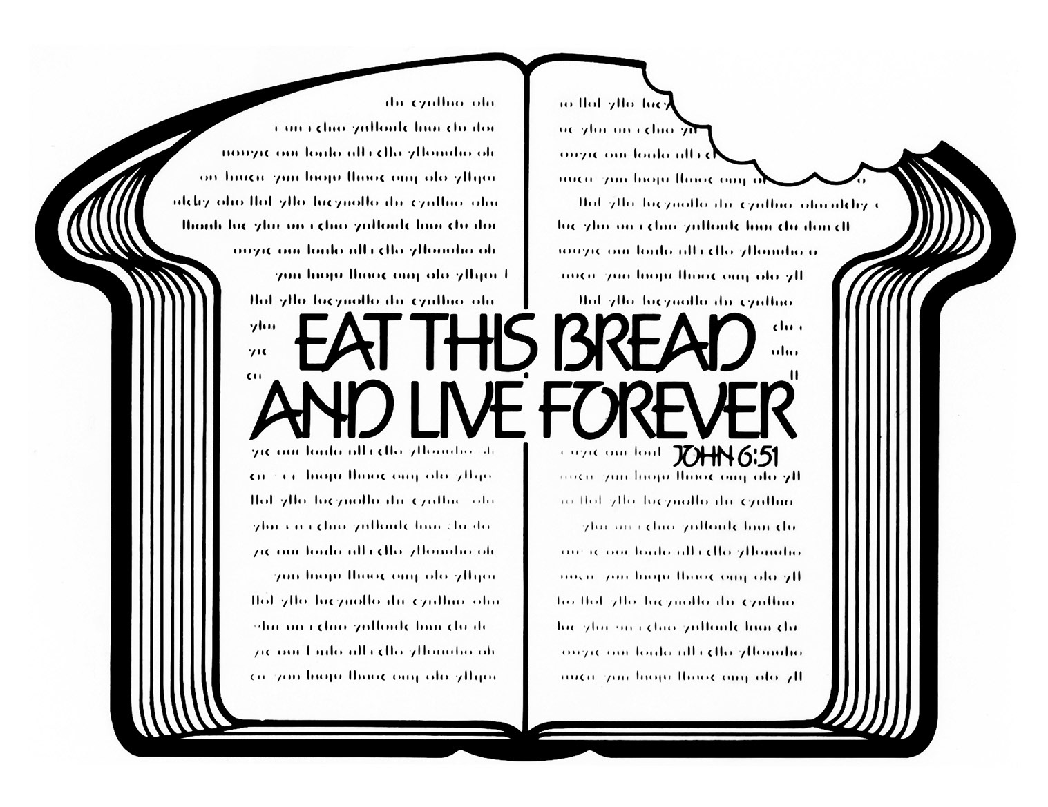

Food for God’s Family was an emphasis on Bible study. Manna Foods was used as a branding logo on posters, brochures and a set of Bible study materials.

Evangels was the logo for an evangelism emphasis.
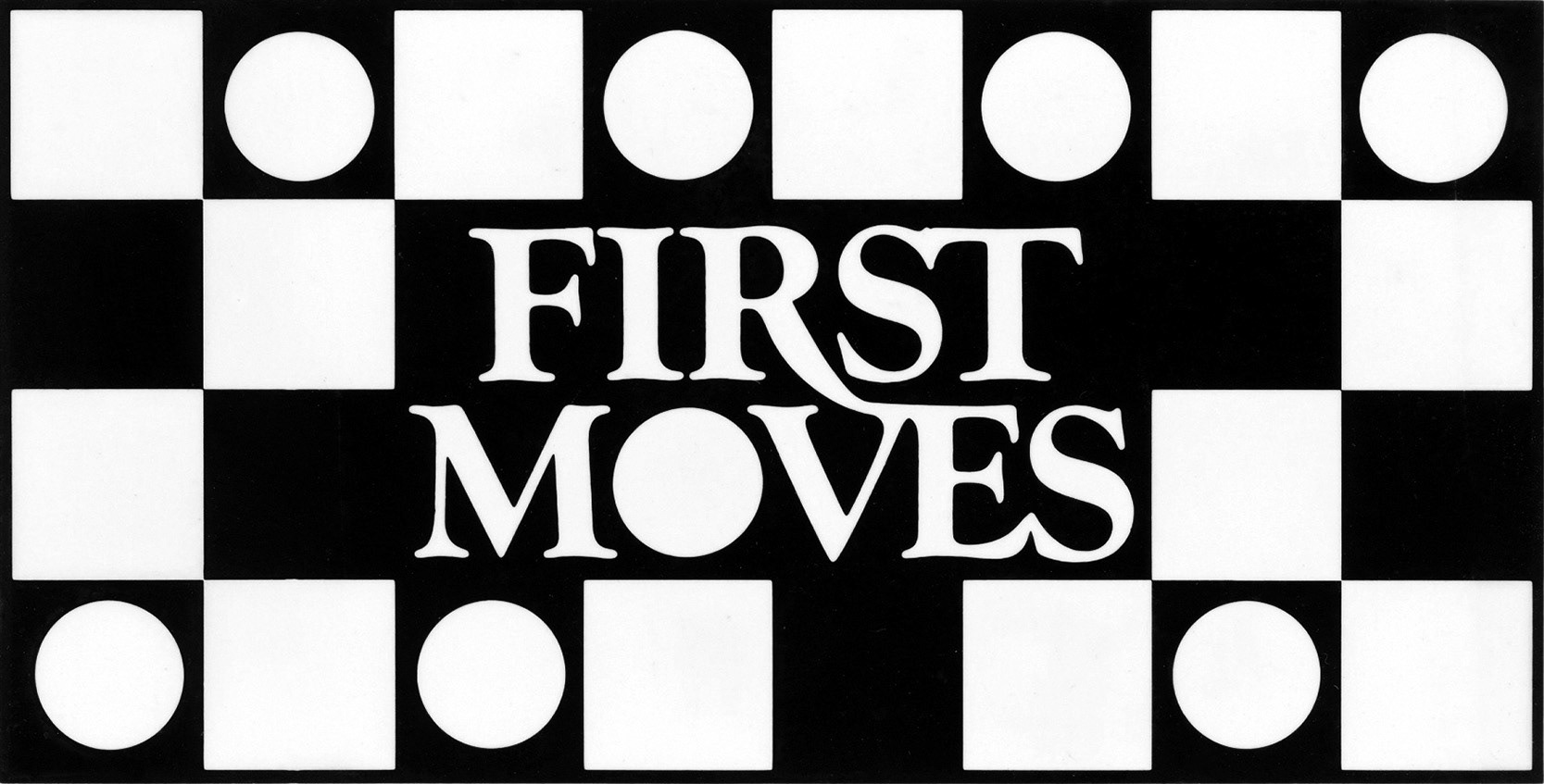
First Moves was the logo for an outreach campaign.
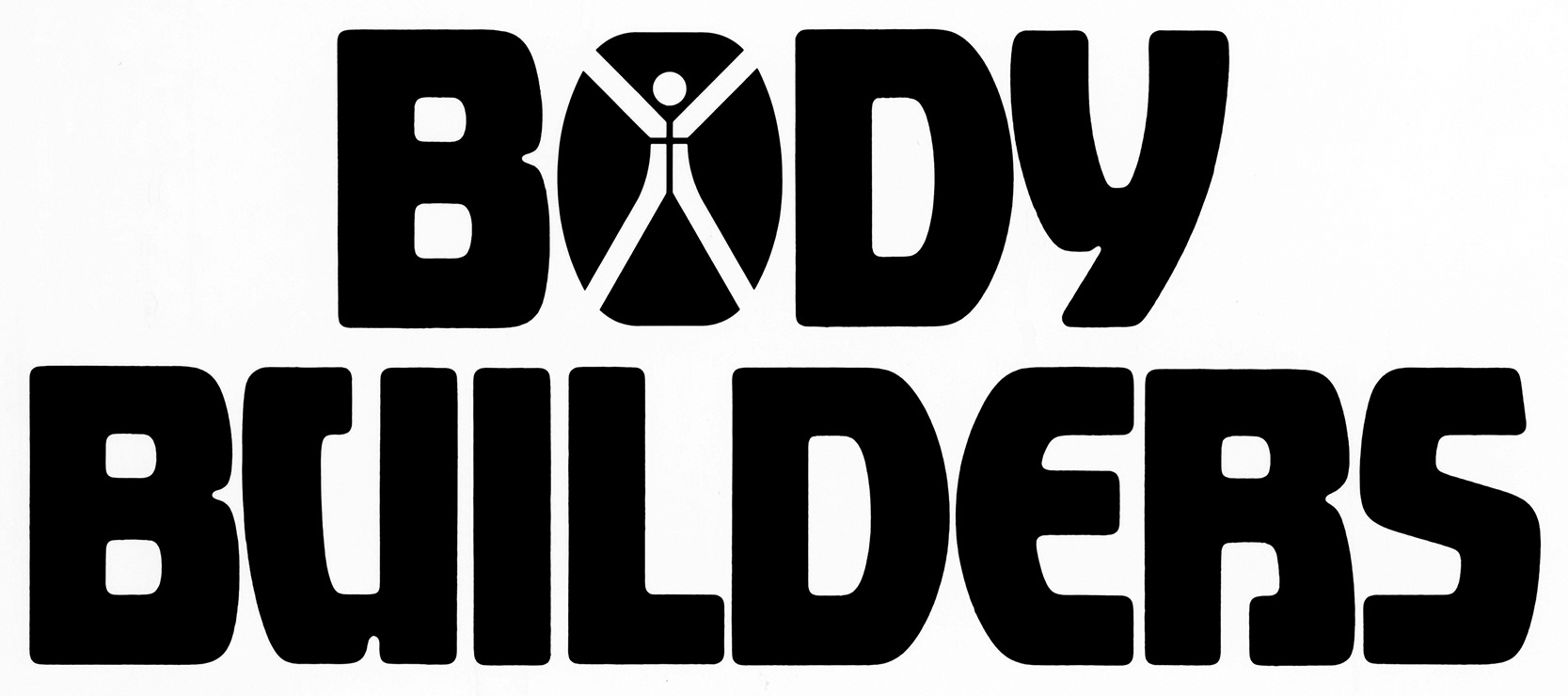

Body Builders was a sermon series by pastor Bailey Smith. The hand drawn tagline was used on posters and other printed materials.
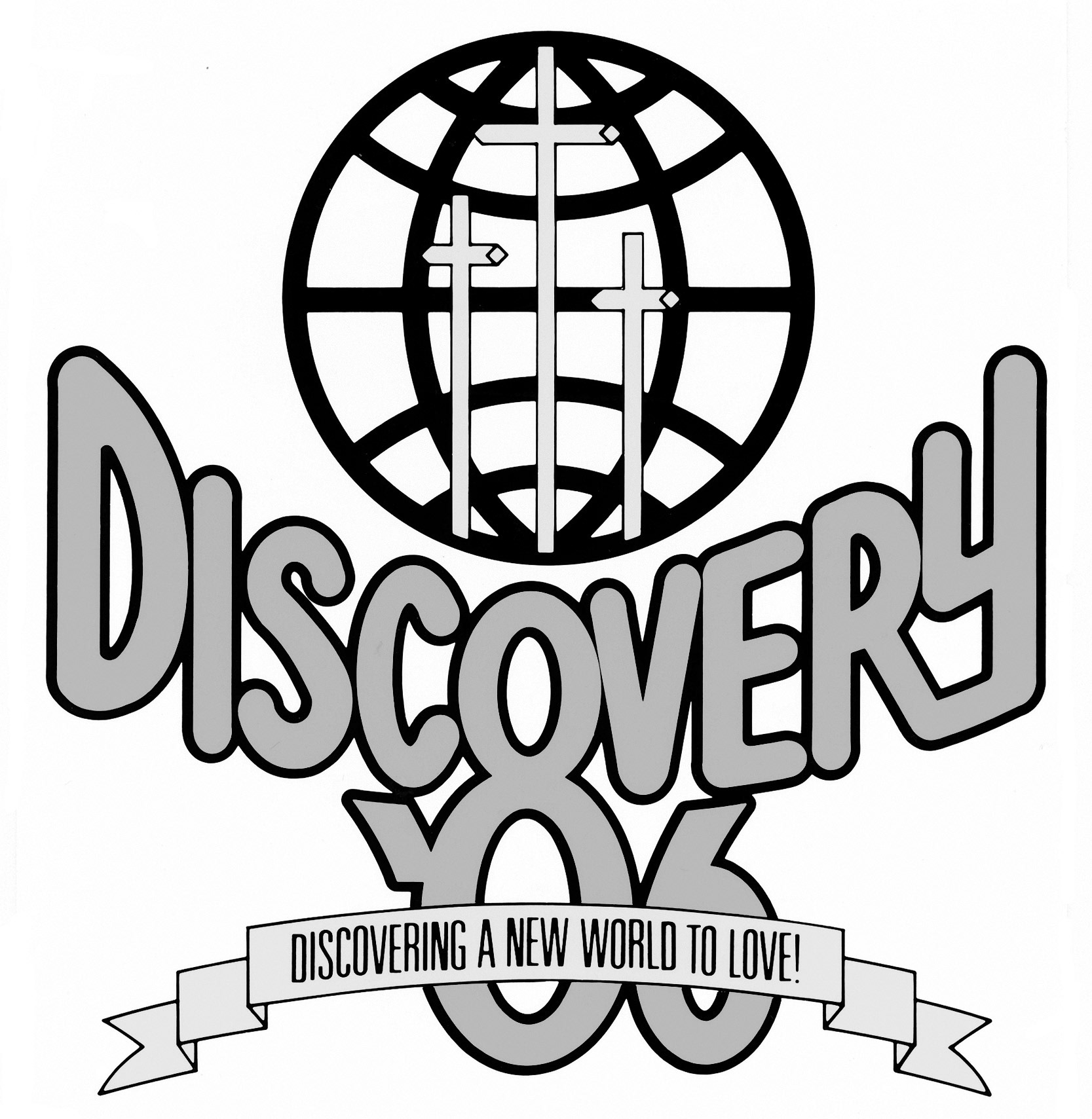
Discovery ’86 was used for a year-long church growth campaign.
Bill wasn’t just a client, he was a dear friend and creative mentor who challenged me to strive for excellence in everything I did. Bill went to be with the Lord in May 2011. His unwavering trust in my abilities gave me the confidence to attempt any undertaking and work without boundaries.