“To be trusted is a greater compliment than being loved.” George MacDonald
In December 1972, Charlie Hamill became minister of education at First Baptist Church in Arlington, Texas, a position he held for many years. I met Charlie in the fall of 1973. Right after the new year, he asked me to design a logo for the church’s yearlong theme: Vision 74. Being between jobs and semesters, I had no trouble completing the logo in time for Charlie to use it in the church’s January 19 newsletter. Besides logos, I designed budget proposals as well as promotional materials for sermon series, high attendance days and more. Our relationship continued long after I moved to Oklahoma in 1978. This was before email, cell phones and the internet, so I had to rely on snail mail, expensive long-distance phone calls and family visits to Arlington to handle his projects. Therefore, the work was sporadic until 1986 when I returned to Southwestern Baptist Theological Seminary to work on a Church Communications degree.
During the fall of 1986, I said farewell to my family after the kids got home from school on Monday, drove to an efficiency apartment in Arlington and commuted back and forth to SWBTS in Fort Worth from Tuesday morning through Friday morning. By 11 am on Friday, I was on the road to Oklahoma in time to greet the kids when they returned home from school. That semester I turned the studio apartment into a design studio (with a small bed in the corner), and Charlie took advantage of my proximity to keep me busy. Below are some of the projects we completed over the years.
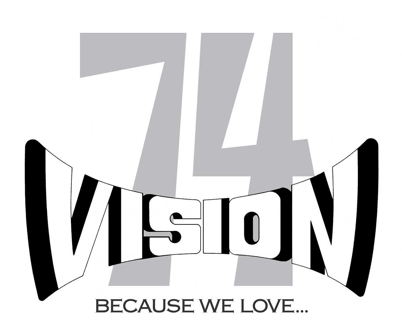
Vision 74 is not only the first logo I designed for Charlie, but also one of the few logos from my earliest years for which I have a copy.
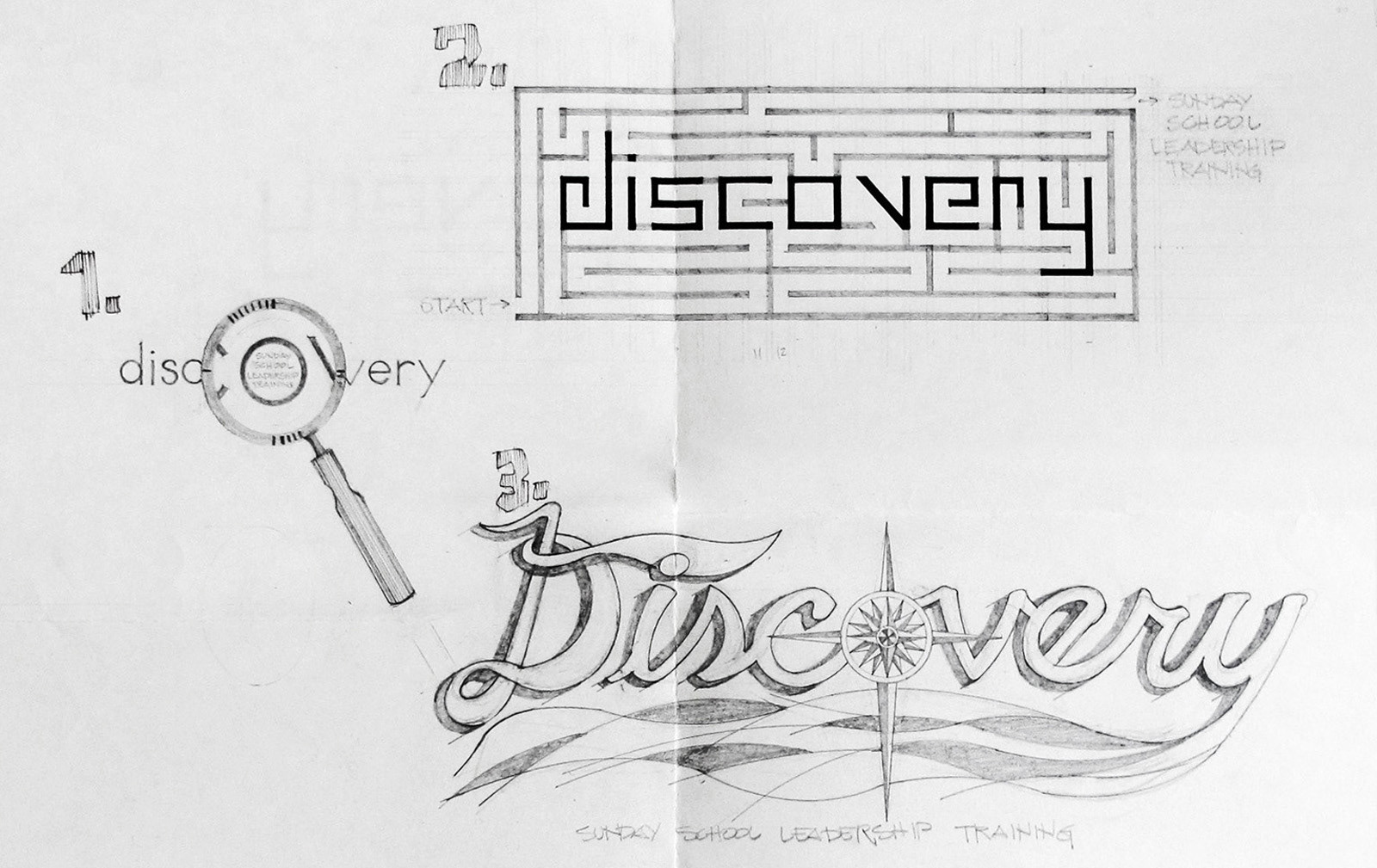
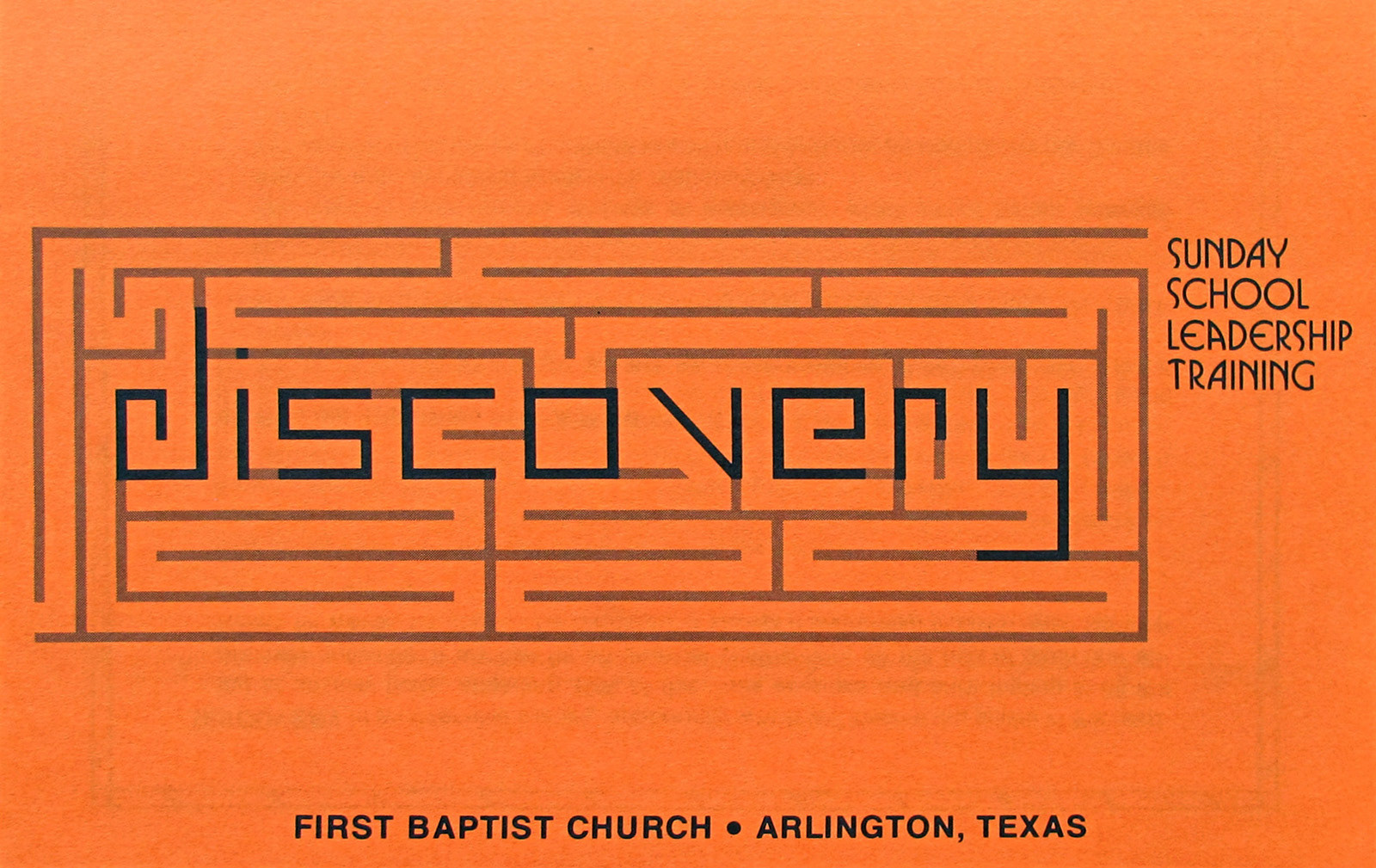
Designed in 1978, this is the cover for a brochure promoting a Sunday School Leadership Training workshop titled Discovery. Pictured above are three concepts that were presented. FYI: The maze really works.
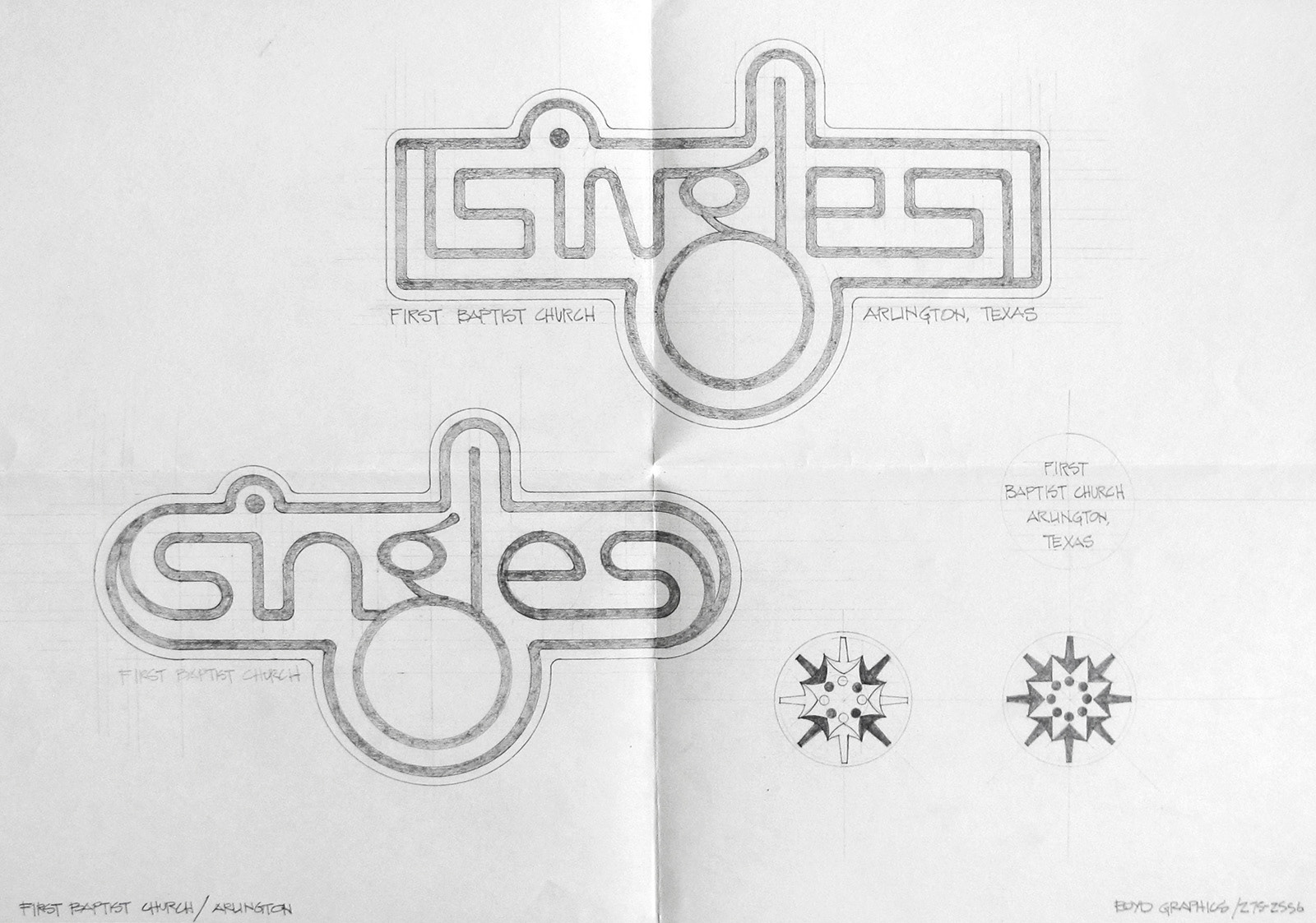
These are preliminary logo designs for the Singles Ministry logo created in 1978. The round icons are designed to drop into the descending loop of the “g.” I don’t have a copy of the finished art, but Charlie selected the rounded logo. I’m not sure which icon ended up in the “g.”
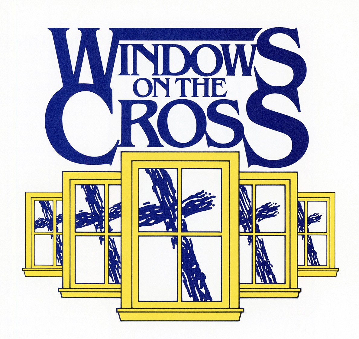
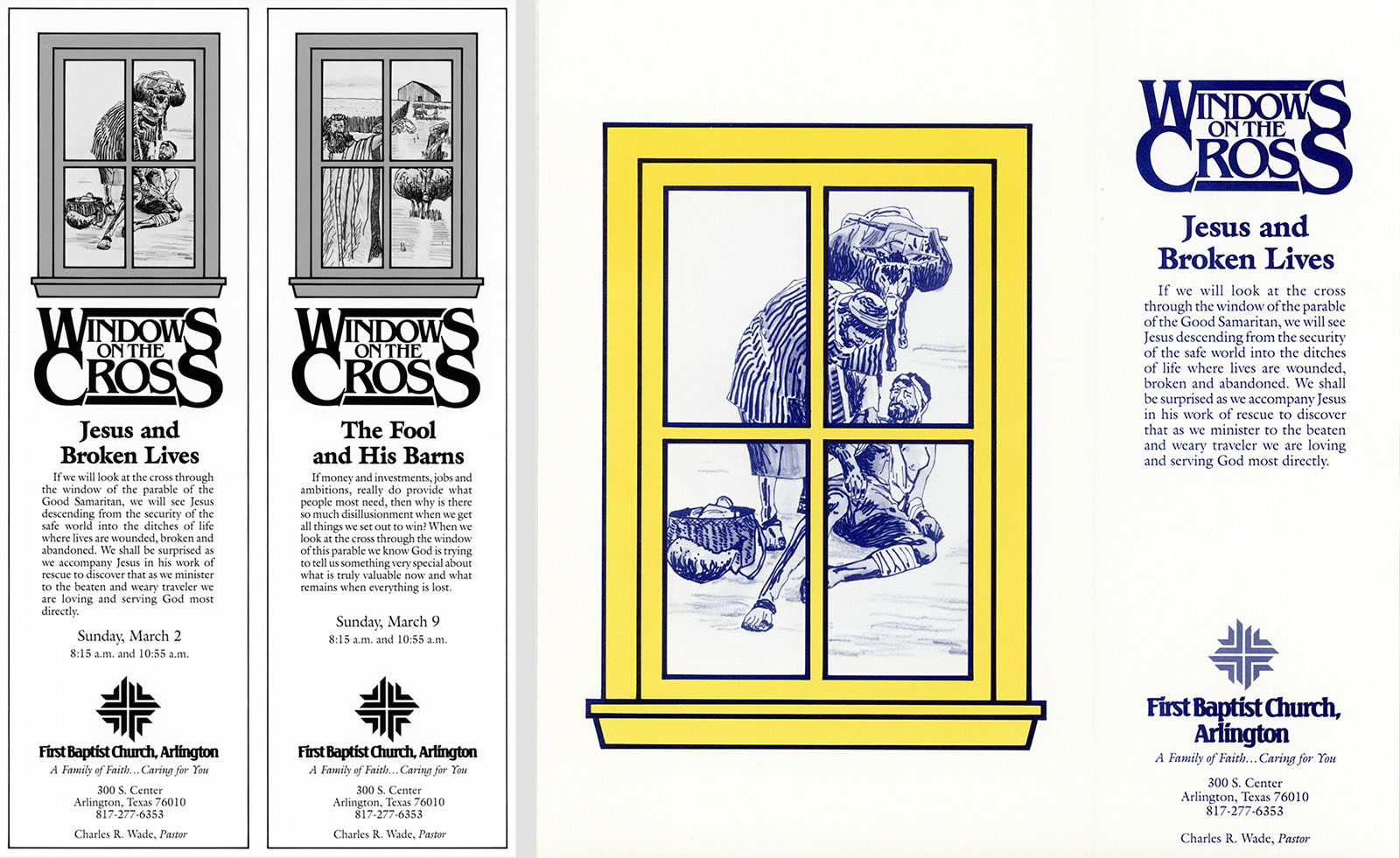
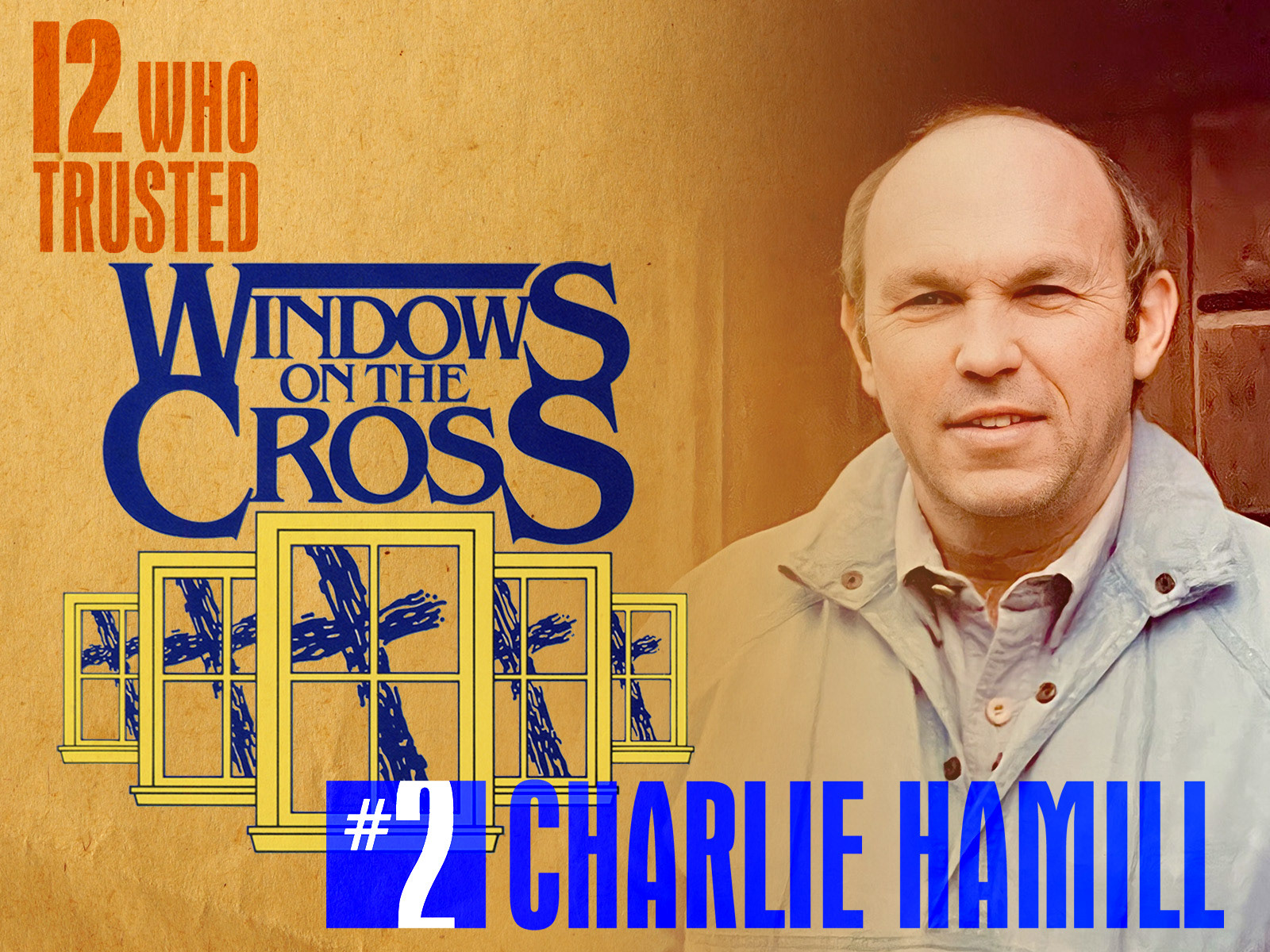
Windows on the Cross is a sermon series from 1986, based on five parables of Jesus, culminating on Easter Sunday. On the left are two of five newspaper ads. On the right are the cover and inside flap of a bulletin.
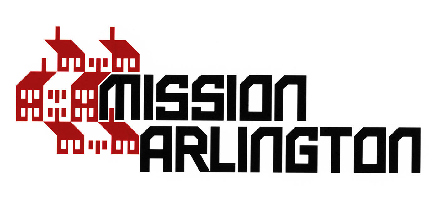
Established in August 1986, Mission Arlington was initially created to start Bible study groups in neighborhoods and apartments across the city. In 1990, as its outreach expanded, “Mission Metroplex” was added to its name, and a new logo was created. However, a truncated version of the original logo is still used on some of their materials, making it the oldest logo I've designed that's still in use. Currently, Mission Arlington/Metroplex sponsors Bible studies and congregations in more than 350 locations. The ministry also maintains a warehouse-size food and clothing closet and provides free medical clinics and children’s activities, year-round. Plus much more.
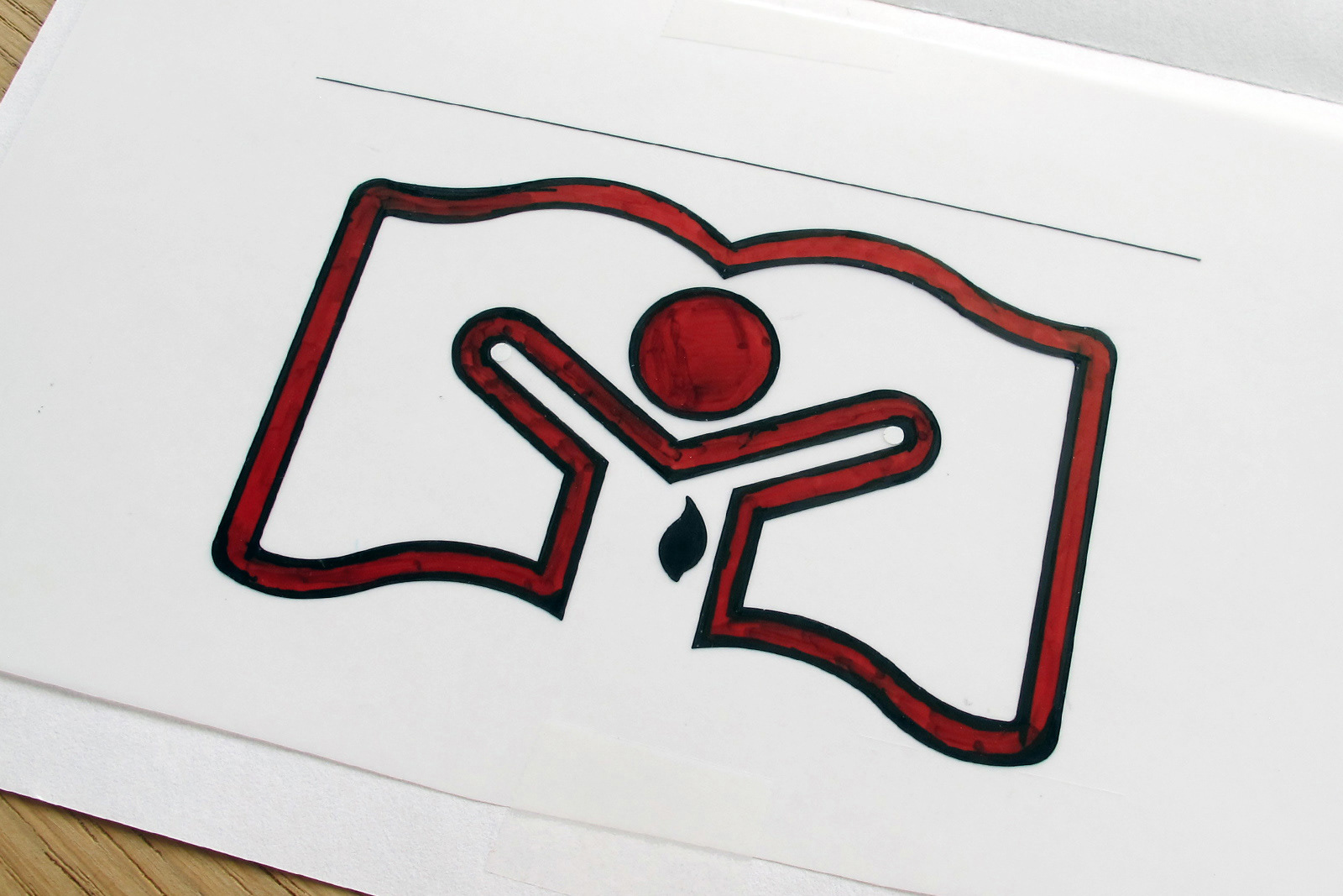

This is the logo for a Spiritual Growth Conference. Here’s another example of the way graphic design was done before computers. Once the logo is meticulously drawn on paper, it is traced on translucent vellum film using technical pens and filled in with a red opaque pen. Both black and red appear black on the photo-mechanical transfer (PMT) of the logo, which is reproduced to the correct size, cut out and pasted on the layout.
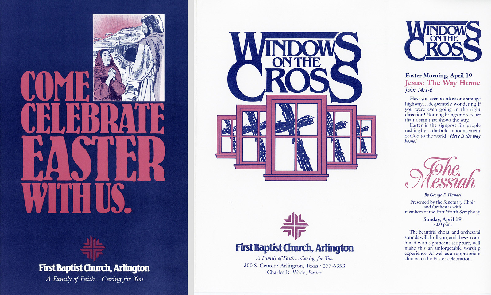
Repeated for a second year, Windows on the Cross was the Easter 1987 theme. On the left is the cover of a direct mail brochure. On the right are the cover and inside flap of a bulletin.
Like several who helped launch my career, Charlie has gone home to be with the Lord. He met his Savior on October 13, 1995. I’ll never forget his kindness and the trust he placed in me as I was learning the ropes and finding my way.