“Failure is built into creativity … the creative act involves this element of ‘newness’ and ‘experimentalism,’ then one must expect and accept the possibility of failure.” Saul Bass
Revamping a logo can be a tricky proposition. I’ve had to do it a few times, and fortunately, all went well. Below are three logo revamps for national brands that didn’t fare as well.
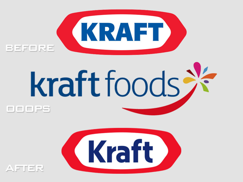
For years, Kraft had a strong logo that nearly every shopper recognized: bold blue lettering surrounded by a red, geometric oval. In 2009, the company unveiled a new logo which they claimed would “more clearly deliver ‘delicious,’” according to its press release. Some argued that the new logo wasn’t a failure, yet when the company reorganized a short time later, it reverted back to the old logo with a slight facelift.
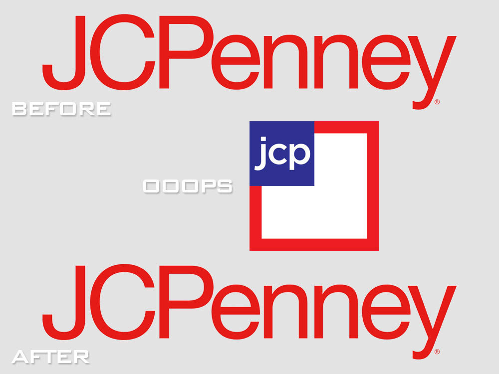
In 1971, JC Penney introduced a new logo that would become a staple for decades. Then in 2012, it unveiled a new logo which featured a square red frame, with “jcp” in a blue box in the upper left-hand corner. In the fall of 2014, it reverted back to its classic design in a move to appeal to loyal — and likely lapsed — customers.
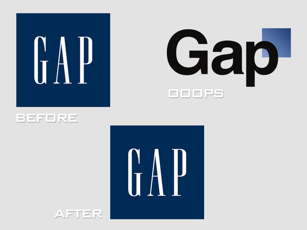
I bet you missed this one. In 2010, Gap rolled out a new logo featuring a graduated blue box perched over the top right corner of the “p” in Gap. After a massive outcry, the retailer reintroduced its former logo — a blue box with “GAP” emblazed across the middle — within a week. Since then, the failed Gap logo has often been referred to as one of the worst logos of all time.